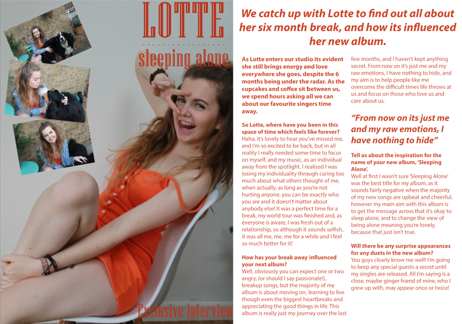
PRODUCTION


Airbrushing:
|
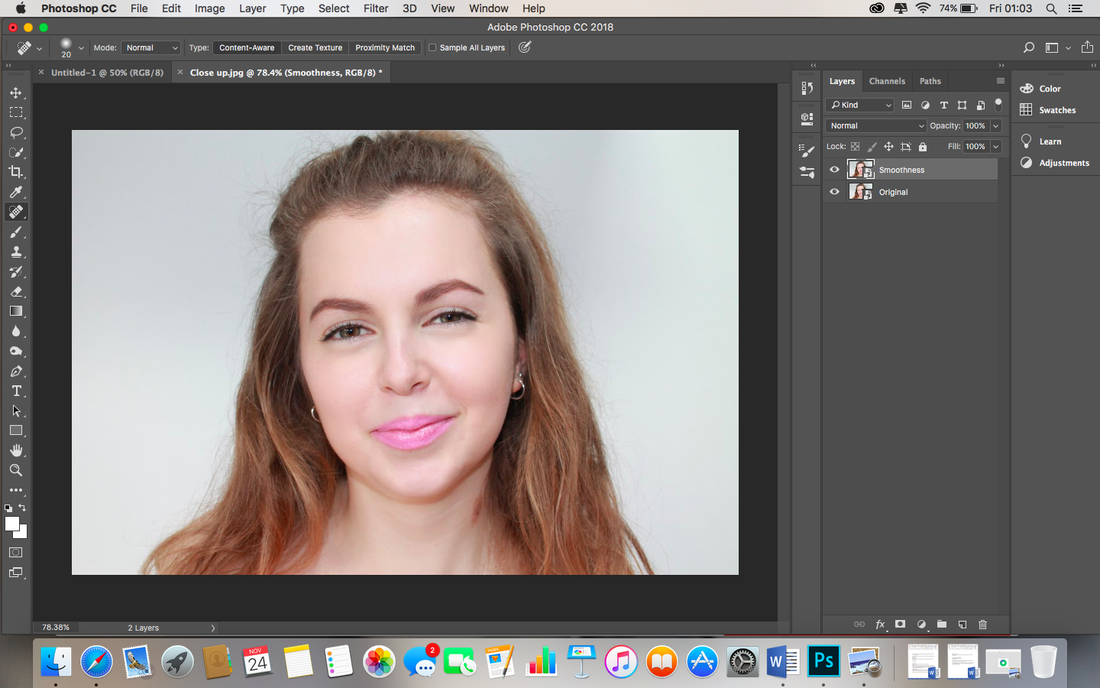
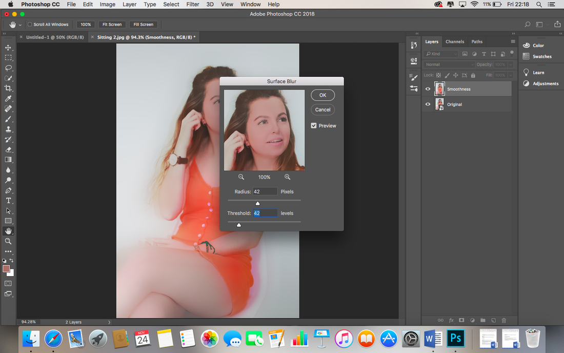
First of all I have made a copy of the original photo 'layer' and renamed the new copy “Smoothness”. |

|
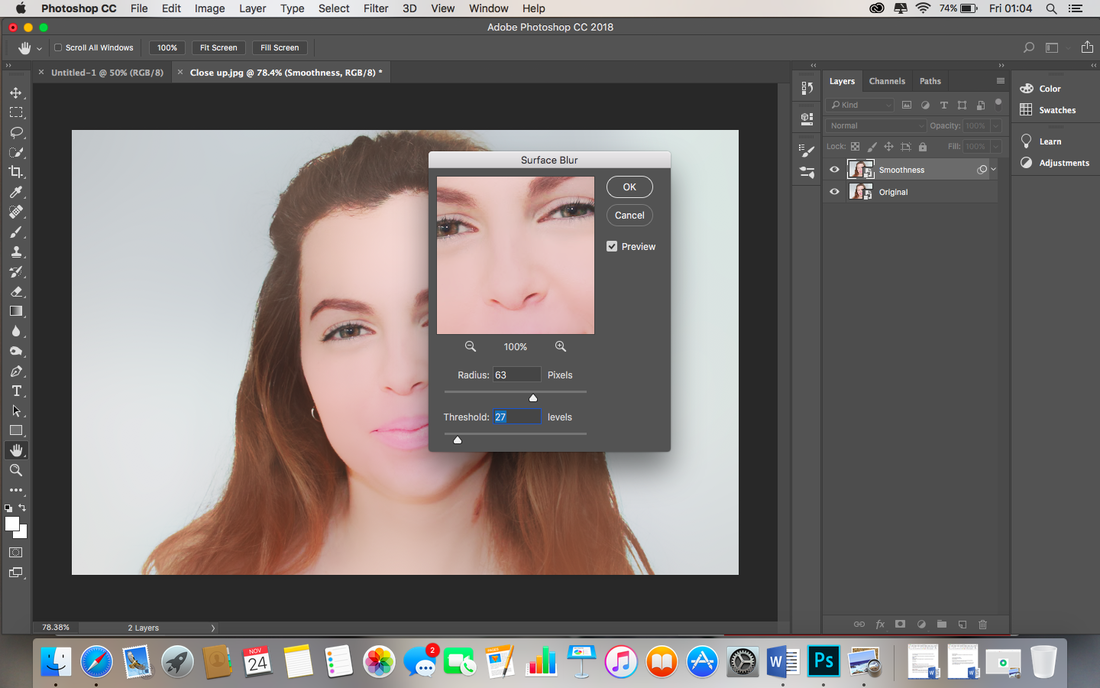
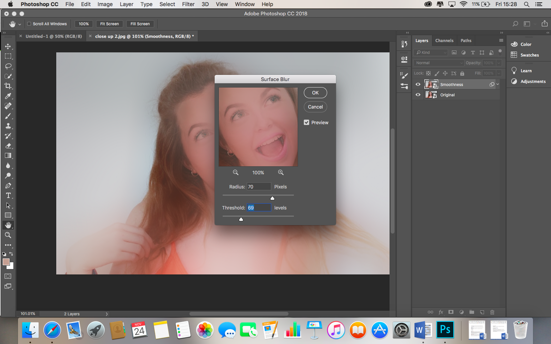
To begin the airbrushing, I make sure the smoothness layer is selected and go to Filter across the top bar, then Blur, then Surface Blur. |

|
The page now looks very blurry, its time to manipulate the photograph by changing the Threshold to the maximum 255, and then changing the Radius so the face looks blurry, then I reduce the Threshold until the details are just about visible, I intend for the skin to still look very blurry, I click OK to confirm. |

|
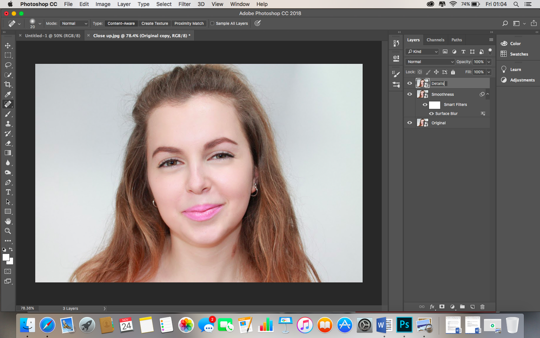
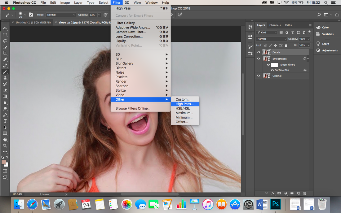
Now I make a further copy of the original layer by pressing Cmd J, and move the new layer to the top of the layer list. I rename the new layer as “Details” by double clicking the text to edit. I will use this layer to restore details in the skin like texture and pores that will have been lost in the blurry 'Smoothness' layer. |

|
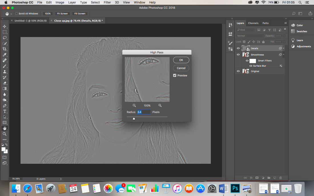
I go to Filter across the top bar, to Other and then to High Pass. I adjust the radius setting until the details are visible. |

|
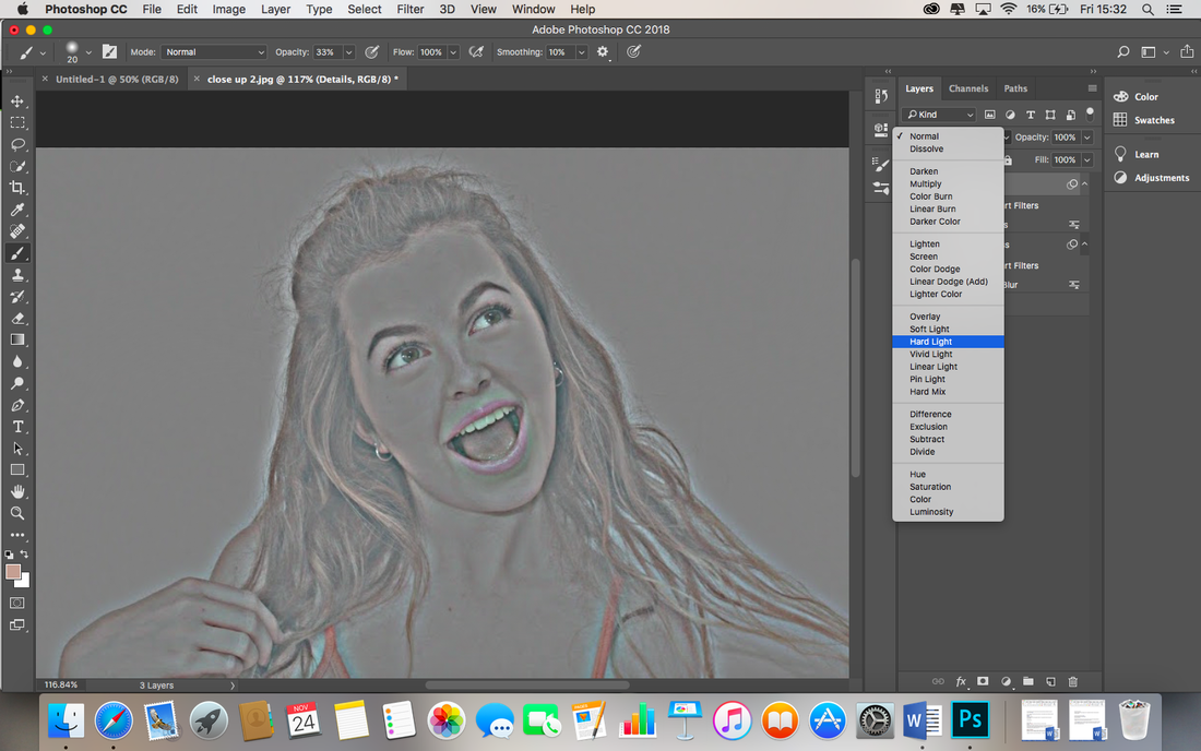
The result of confirming High Pass and adjusting the settings give this result. |

|
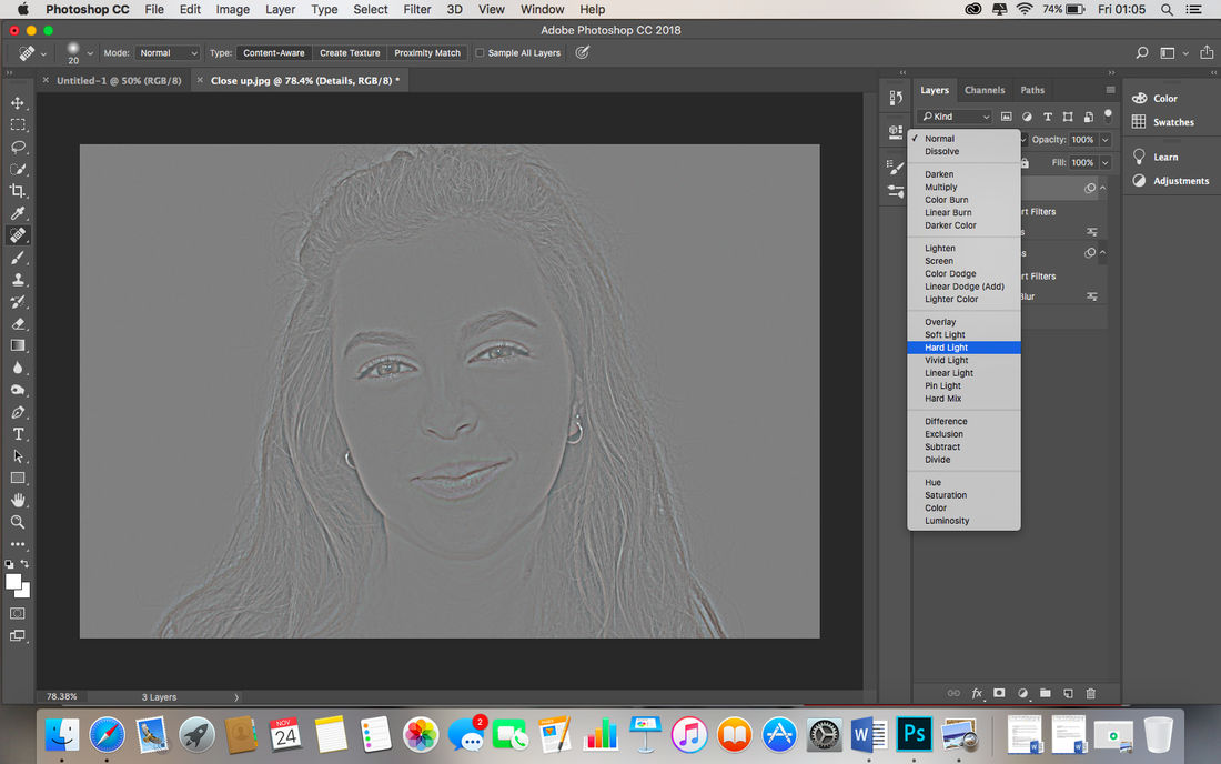
I then change the blending mode in the drop box stating 'normal' as demonstrated above, to the Linear Light setting. |

|
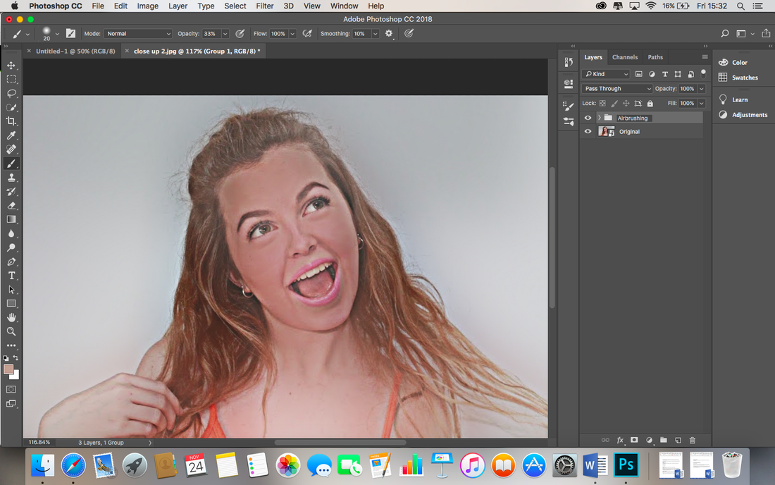
As a result of the editing so far, the skin looks flawless, but plastic/fake. As my model already has very clear skin, this isnt particularly obvious, however I would like to reduce the plastic look to create a more realistic finish, due to the ethics surrounding celebrities and the impact of overly airbrushed images on the young target audience. |

|
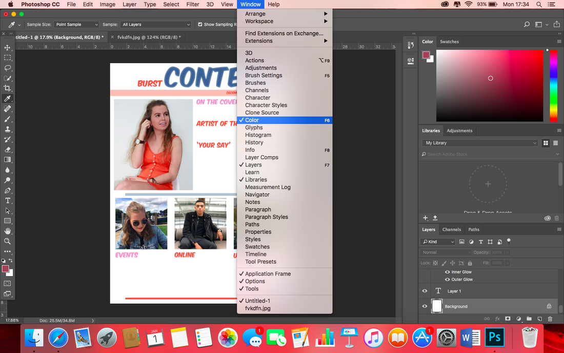
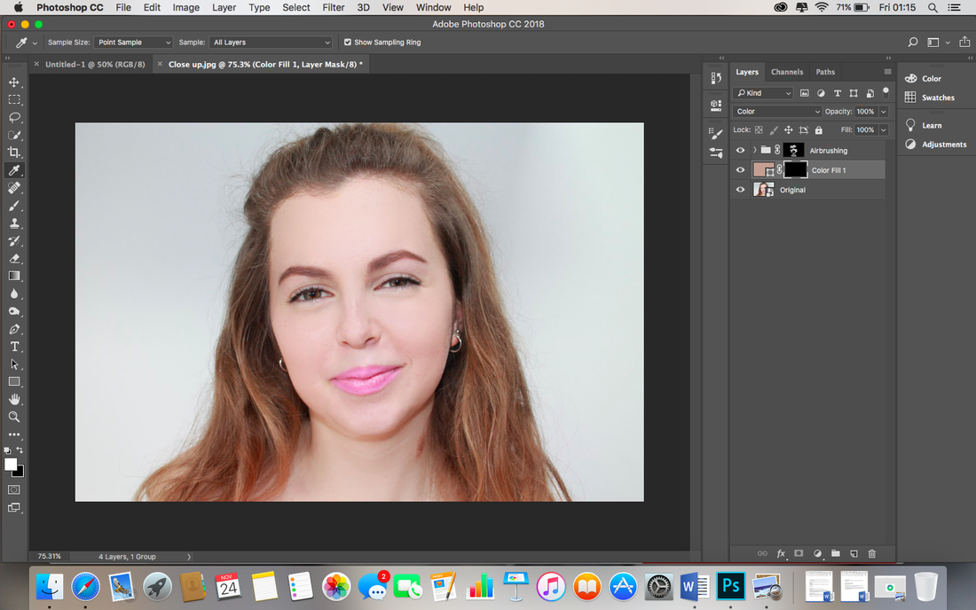
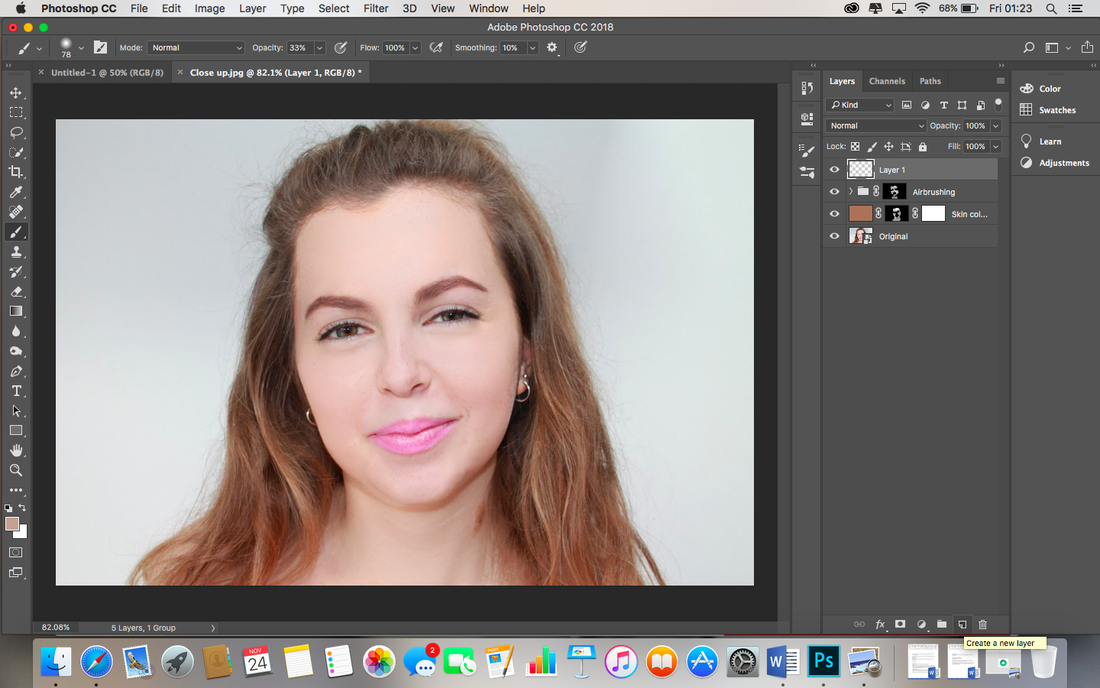
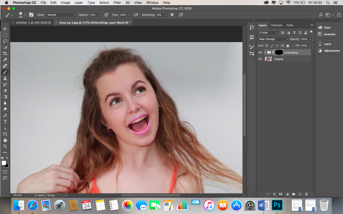
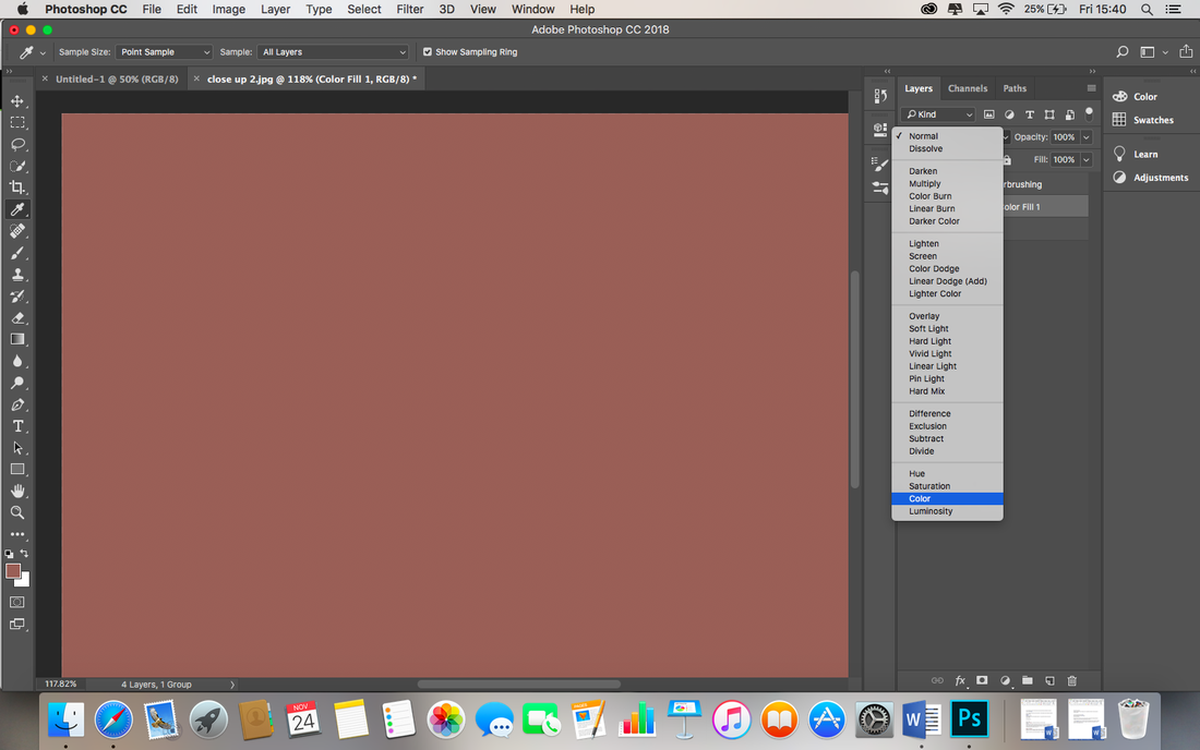
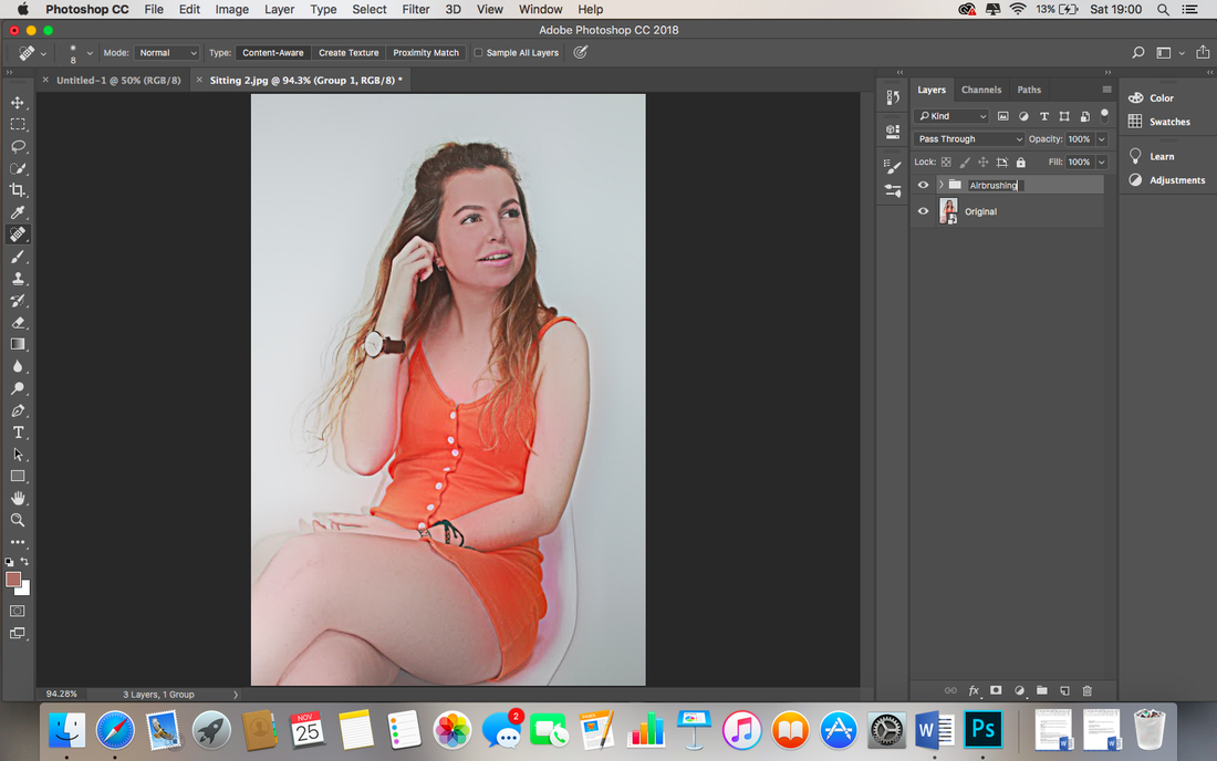
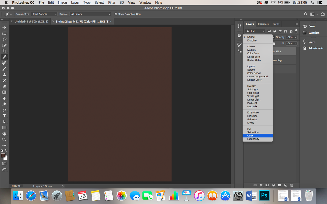
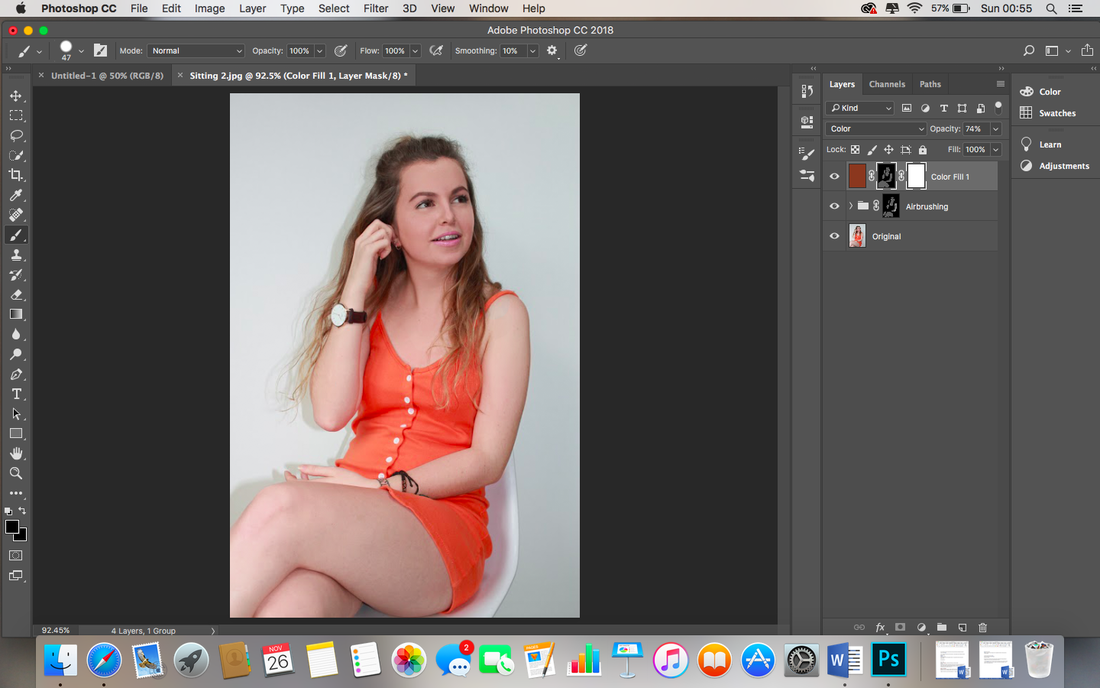
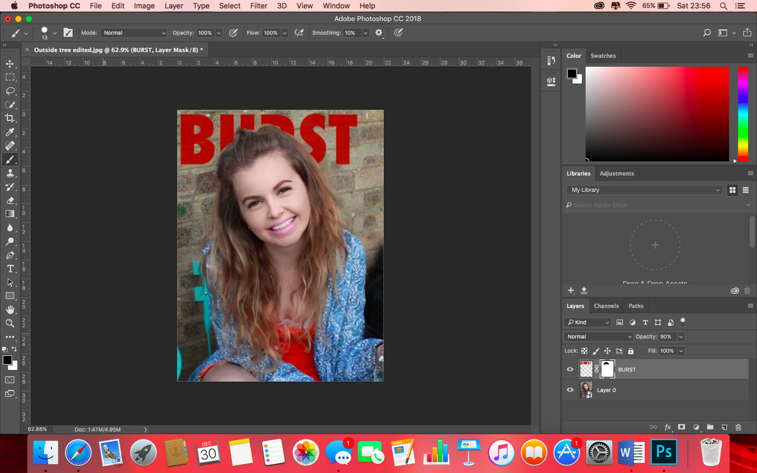
Now we’re going to adapt the colour of my models skin. First, it is necessary to group the layers I have already worked on to preserve the work I have done so far. I select the Details and Smoothness layer and press Cmd and G at the same time to group them. I double click the title of the group and rename it Airbrushing and add an 'inverted layer mask' to the group by holding the Alt key and pressing 'Add Layer Mask' button (the rectangle with the circle in) in the Layers panel. I ensure the foreground colour is set to white by clicking D on the keyboard.
|
Skin tone:
|
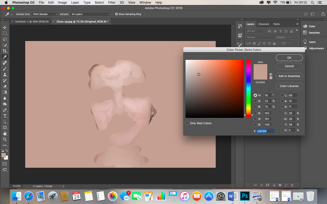
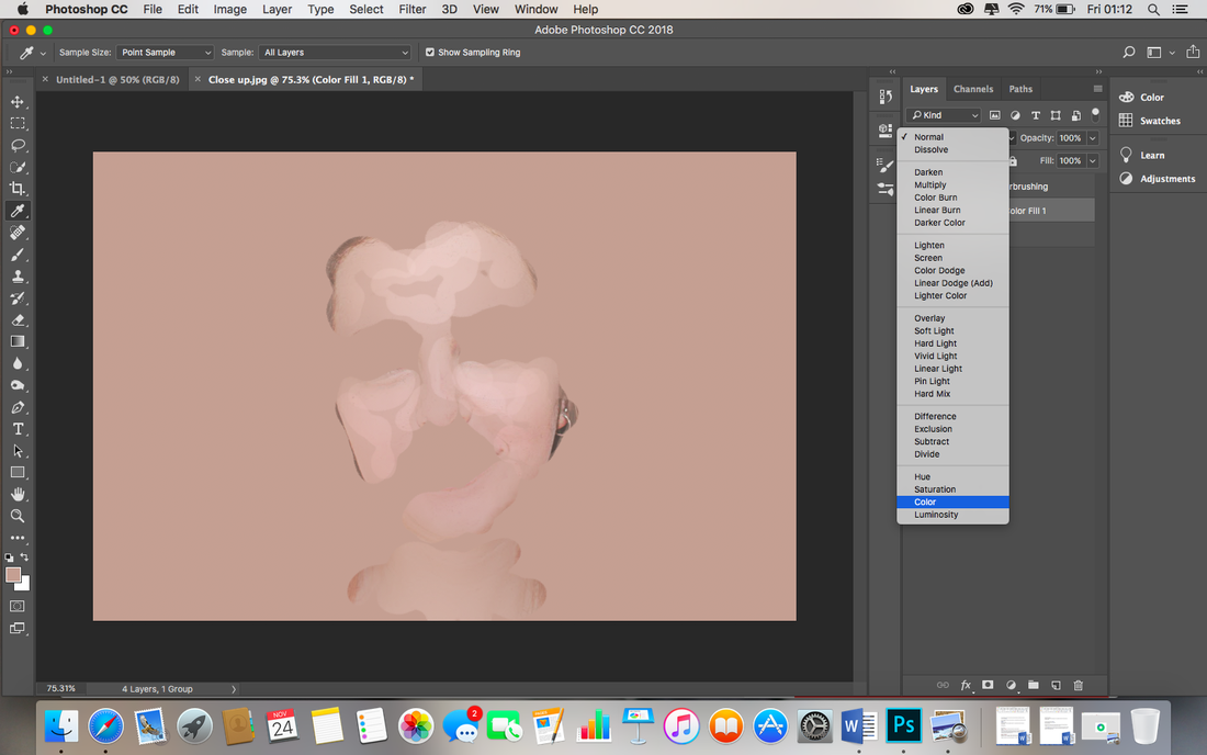
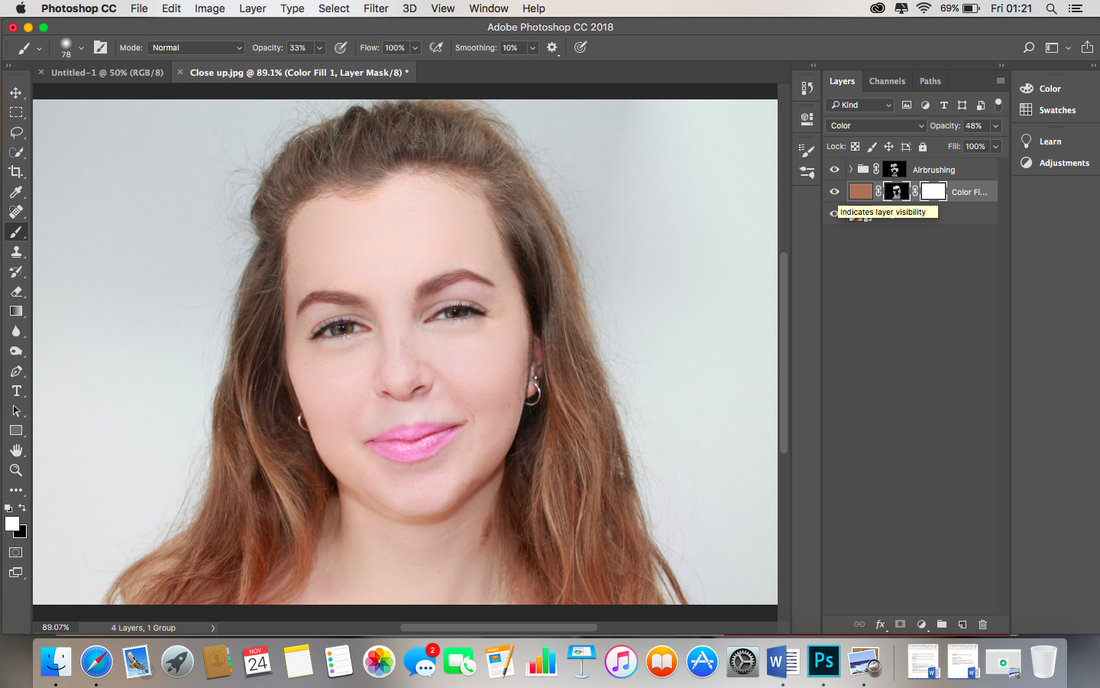
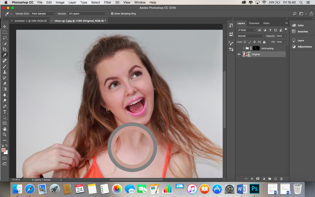
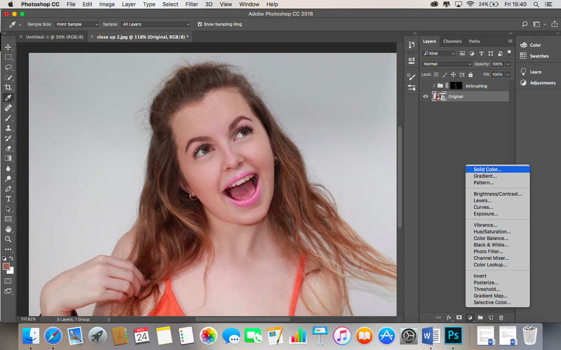
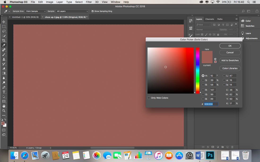
I want to edit the colour of the skin of my model, her skin is flawless but I would like to add more colour. I select the 'Eye Dropper' tool and hover over areas of her skin, I find a darker tone of the skin and decide this is the colour I would like to implement. I go to Layer, New Fill Layer, Solid Color and press ok, I change the blending mode to 'colour', found above the layers list on the right hand side of the screenshot above. I click on the layer mask and invert it by pressing Cmd+I. I select the brush tool on the left hand side above and paint the new darker colour over the skin. I adjust the opacity of the colour to work on the lighter and darker areas of the photo, for instance, I used a increased opacity in the areas where I natural shadow occurred like under her hair. To finalise, I renamed this layer to skin colour for reference.
|

|
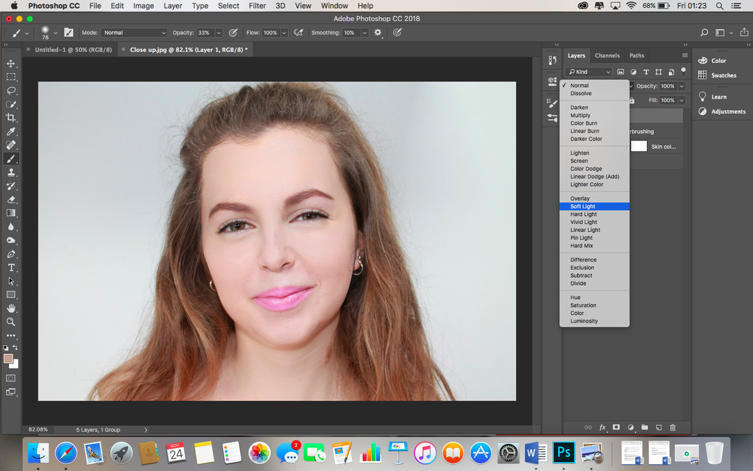
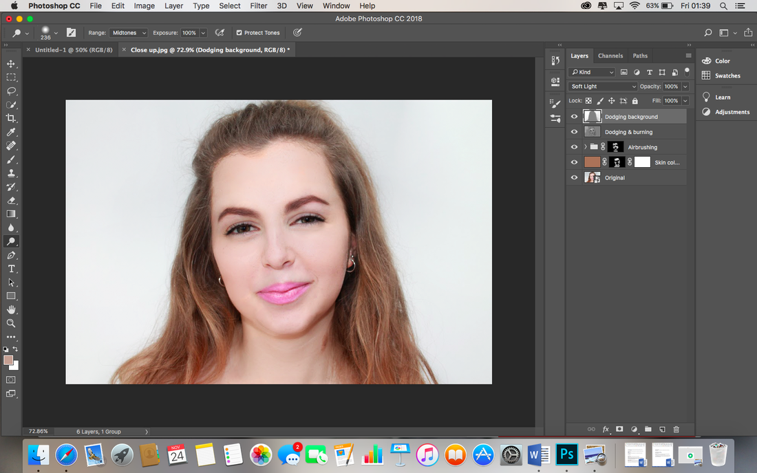
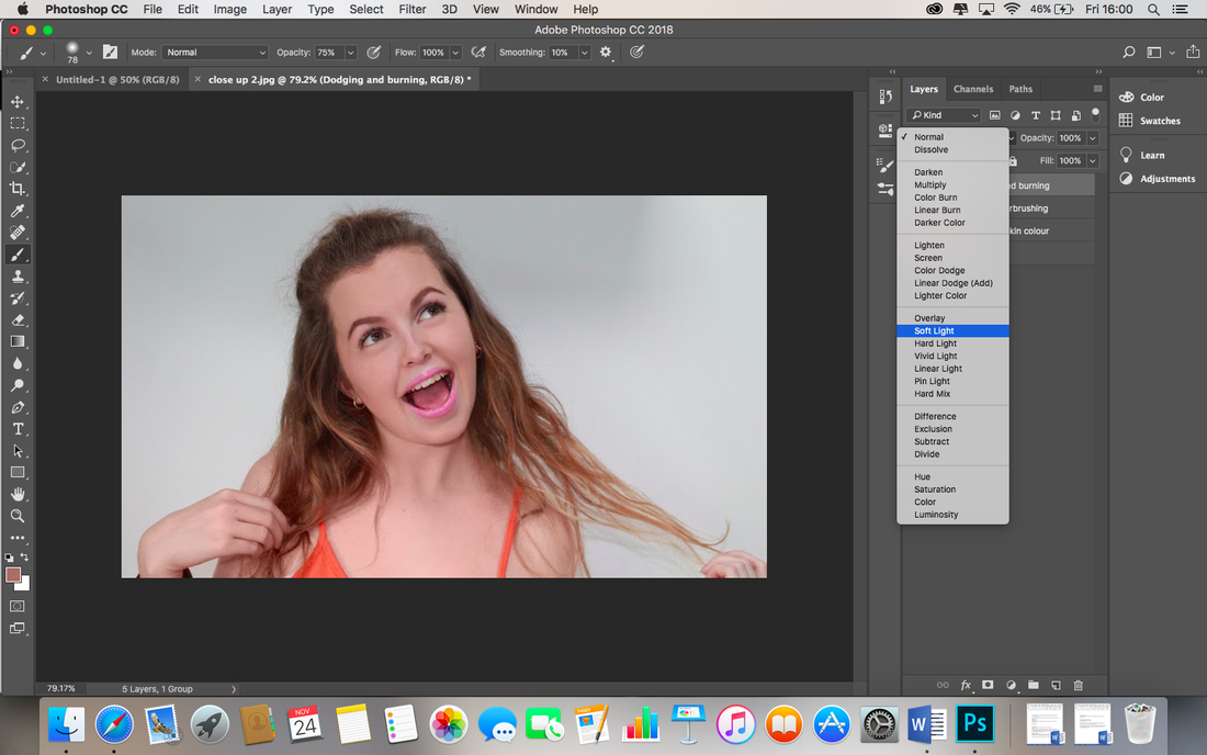
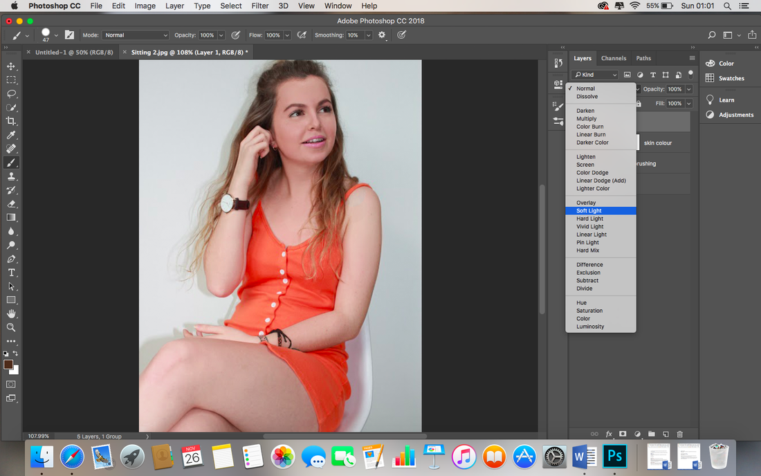
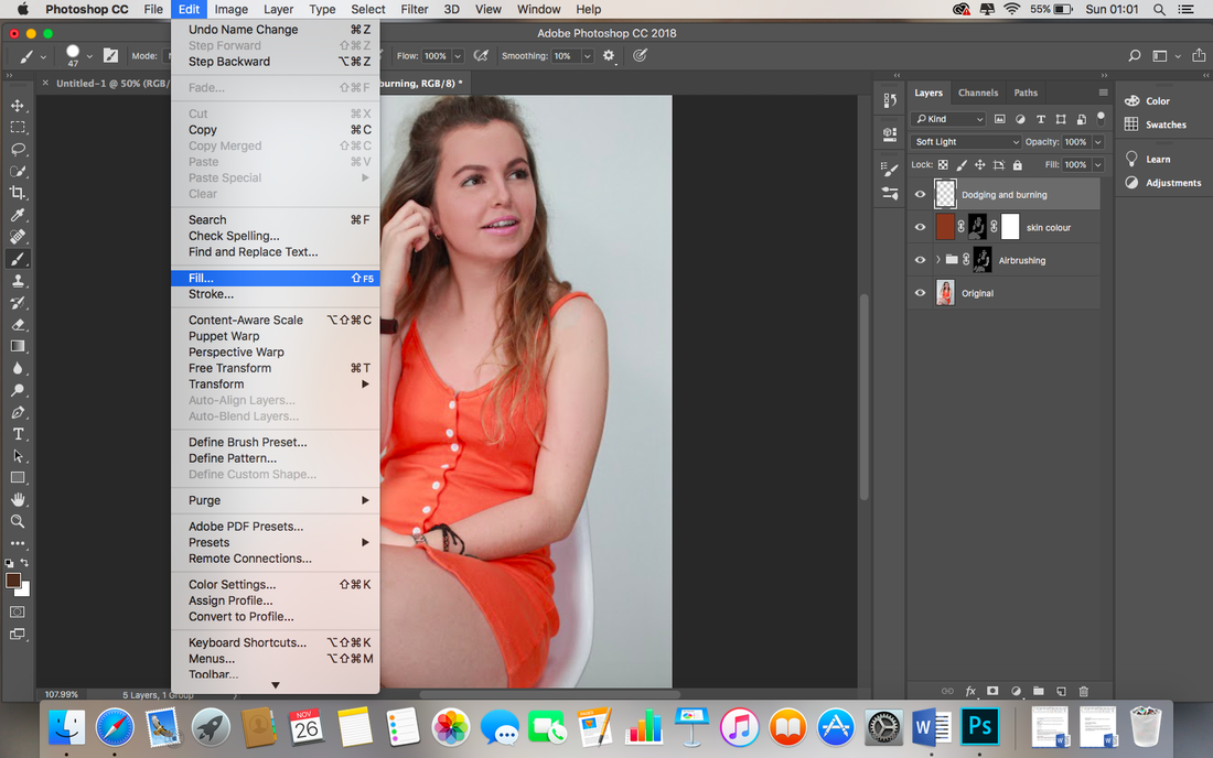
Next, I will use the dodging and burning tool on a new layer to lighten and darken areas of the photos, increasing the studio like effect. I created a new layer which I renamed 'Dodging & Burning'. |

|
As demonstrated, I changed blending mode of the Dodging and Burning layer to Soft Light. |

|

|

|
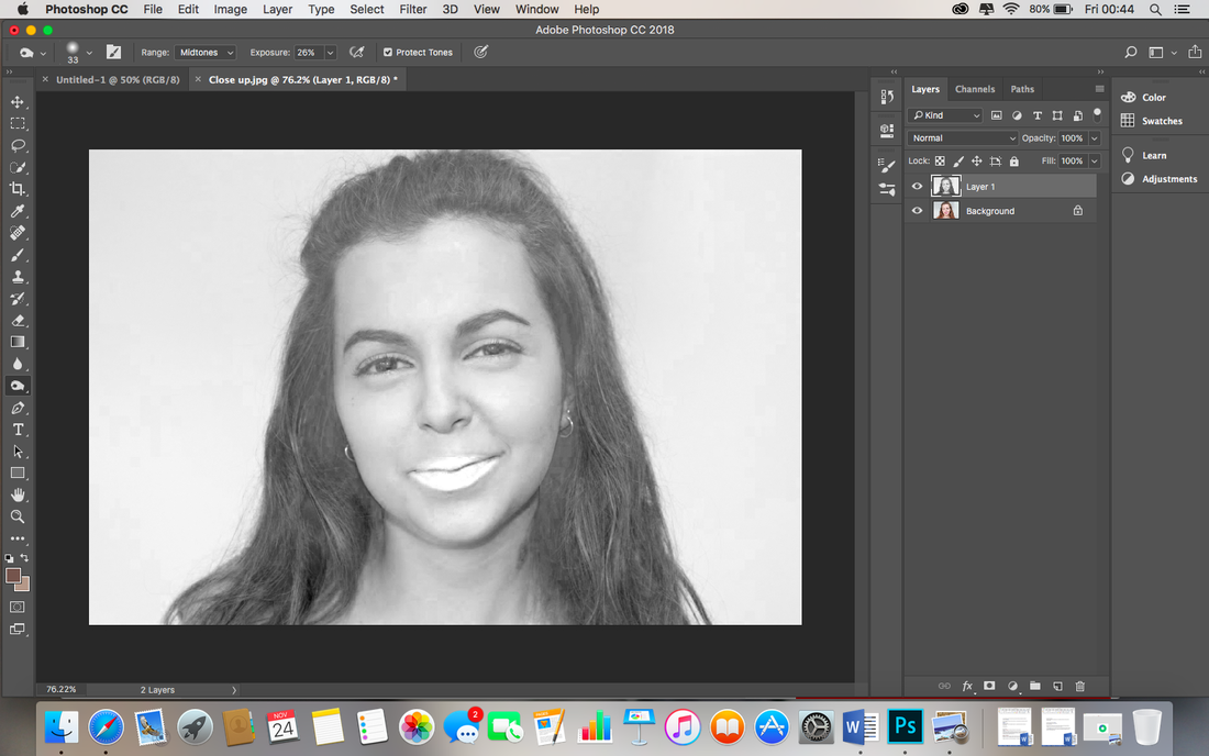
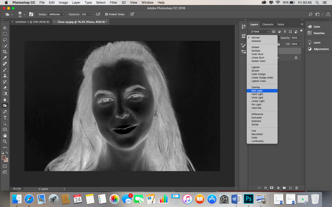
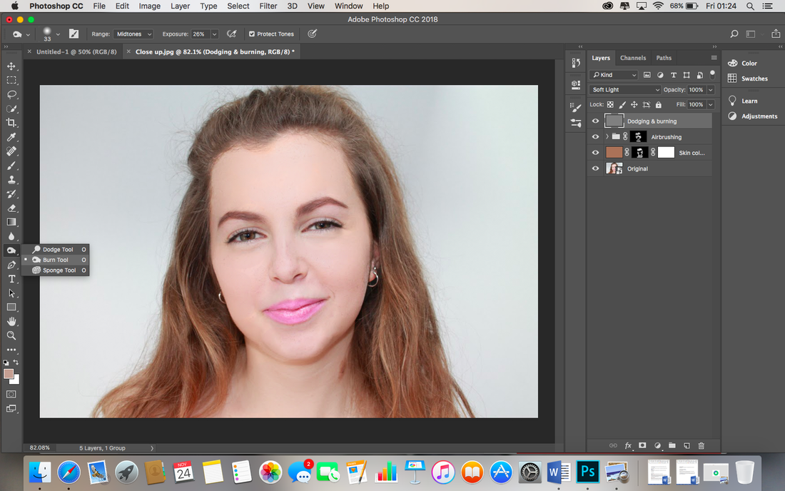
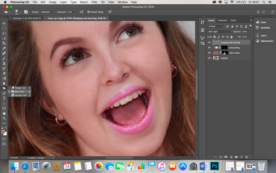
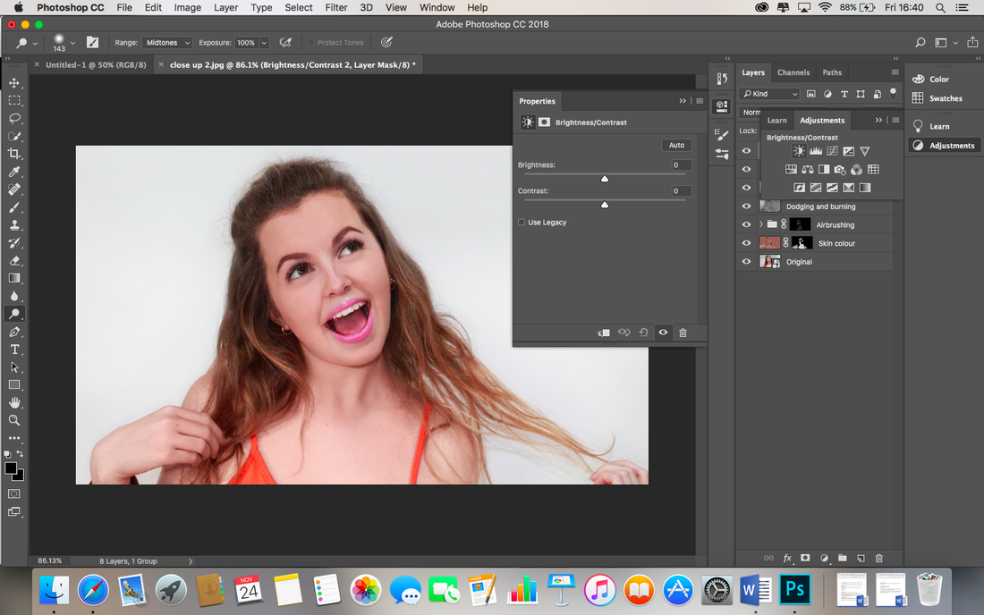
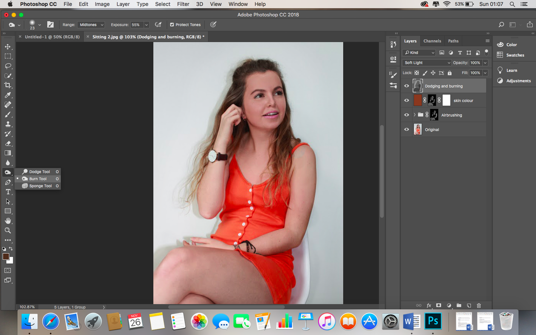
I click with two fingers on the hand icon on the left hand side and choose the burn tool, I then change 'Range' on the top of the screen to 'Midtones' I begin with the exposure at 50% but soon realise I must lower it to around 26% as 50% is far too intense. I now paint the areas to darken, the eye area, the eyebrows and jaw line and line on the neck to give definition and exaggerated pop convention finish. I then lighten areas by clicking on the hand icon again with two fingers and select the Dodge tool. Again I make sure the Range setting is set to Midtowns and again paint over the areas to lighten, the lip colour is heightened this way, the teeth are subtly whitened, whites of the eyes and areas where the light would naturally hit, such as the bridge of the nose.
|

|
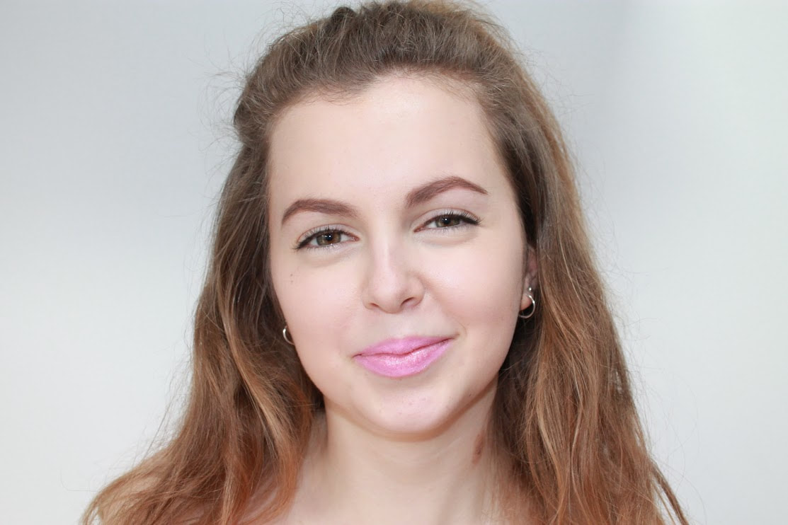
This is my second image before any editing. My aim of this Photoshop session is to airbrush the models skin and reduce discolouration. As this shot is a close up, I will have to be extra careful with my technique. |

|

|
|

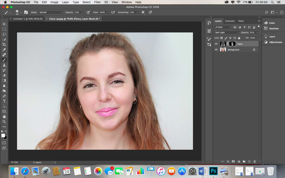
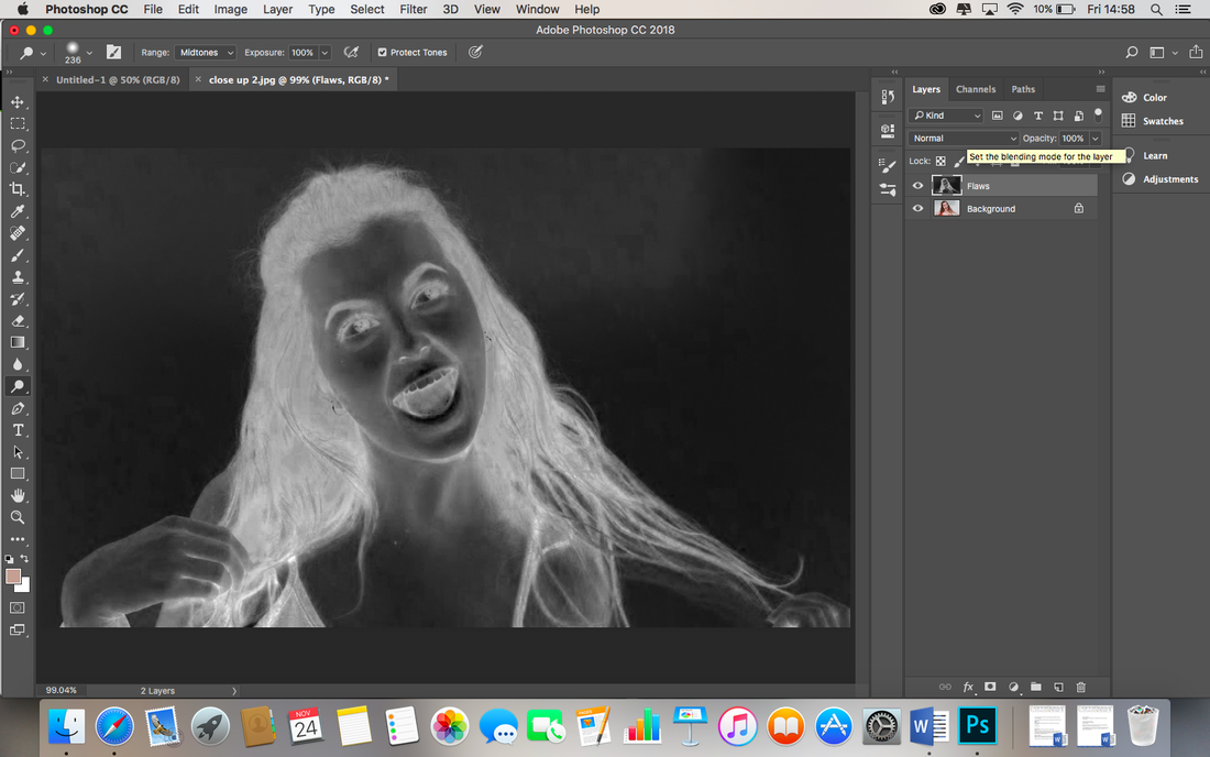
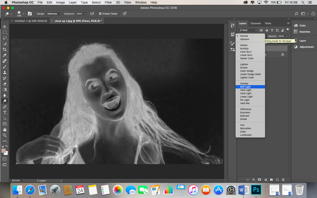
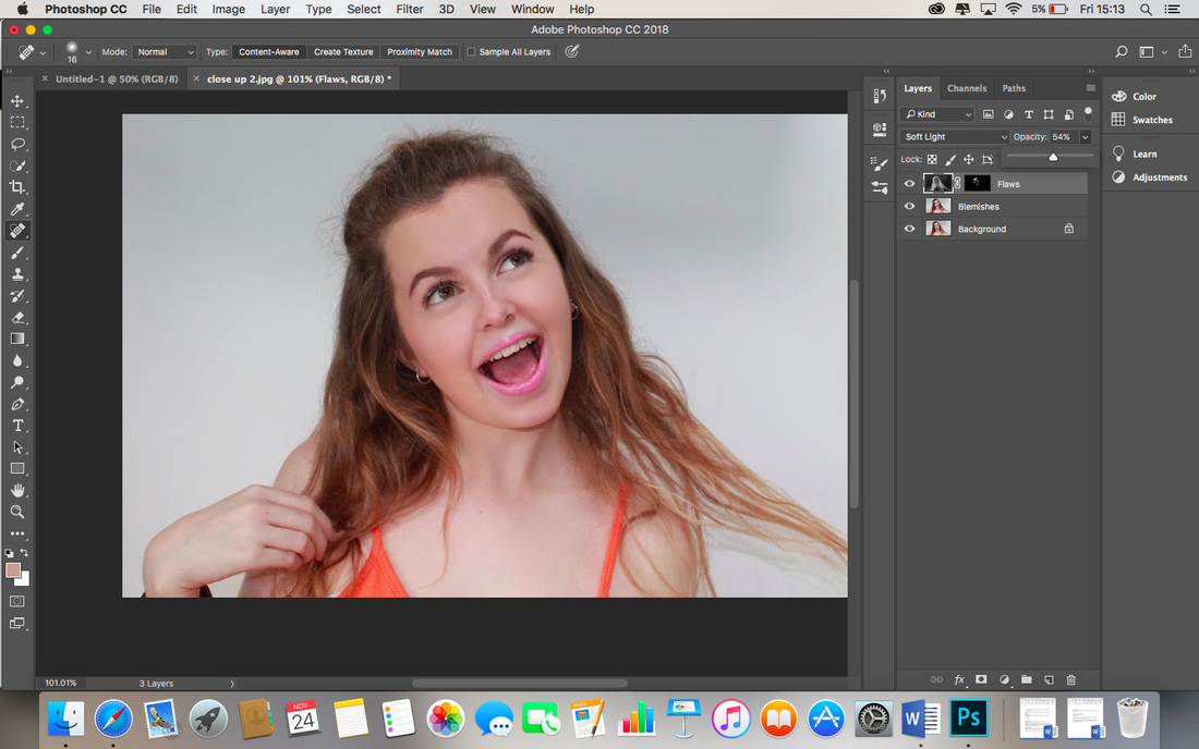
I rename the new layer as 'Flaws' and invert the layer by pressing Cmd I.
|
I change the blend mode to 'Soft Light'.
|
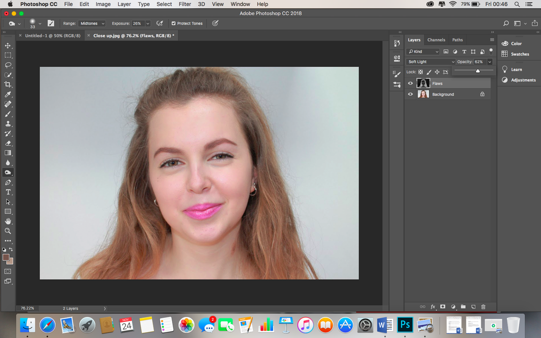
The result looks too strong.
|

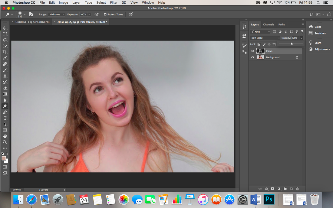
Reduced the opacity to approximately 62% to get a combined finish.
|
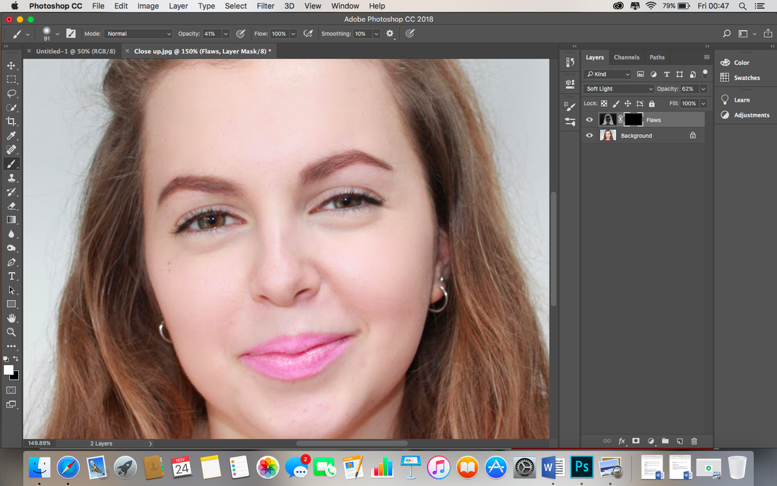
I added an inverted layer mask by holding down Alt and pressing the rectangle with a circle inside, icon.
|

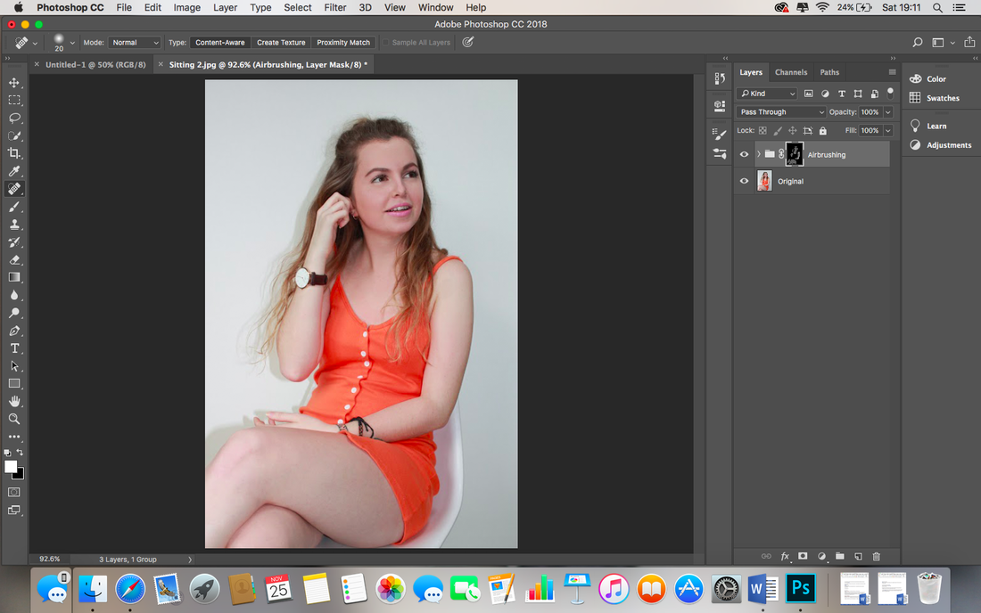
I select the brush tool and paint on the airbrushed finish, allowing me to pinpoint where I want the airbrushing.
|
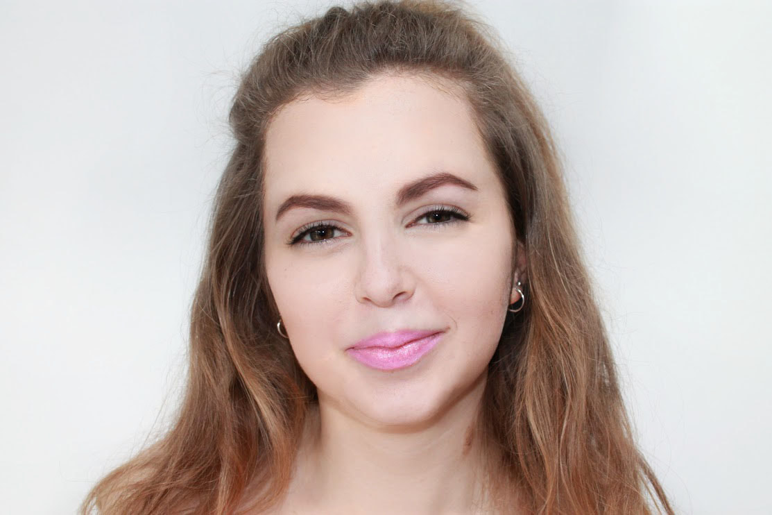
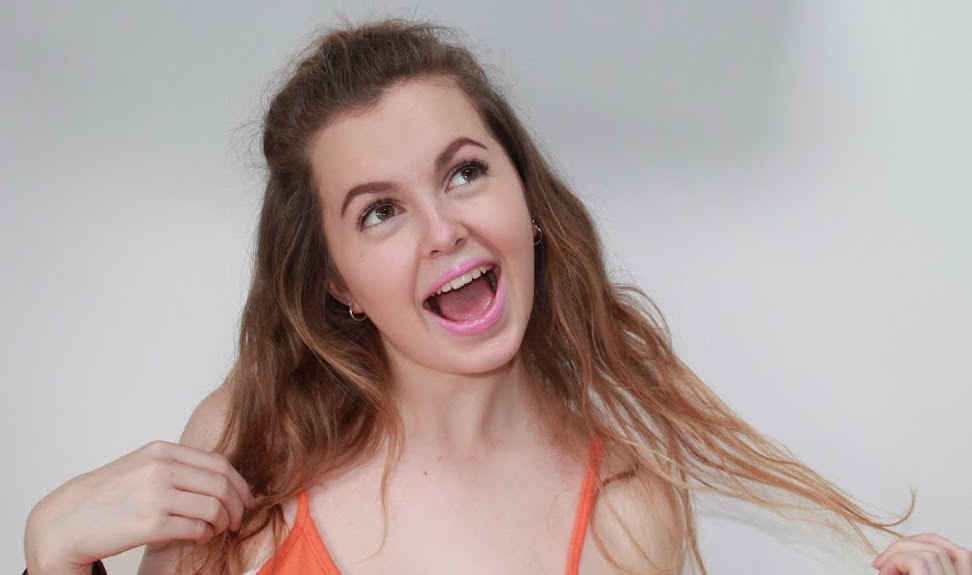
So far, Before^.
|
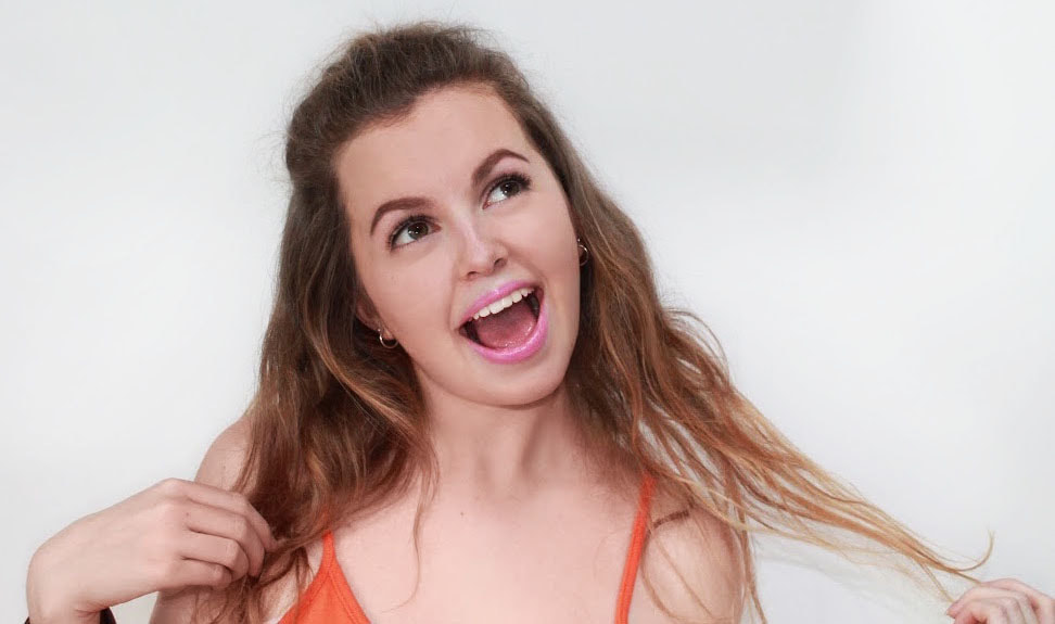
After^.
|
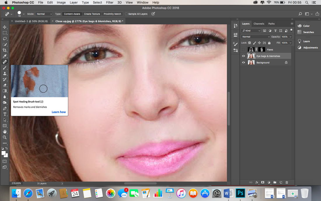
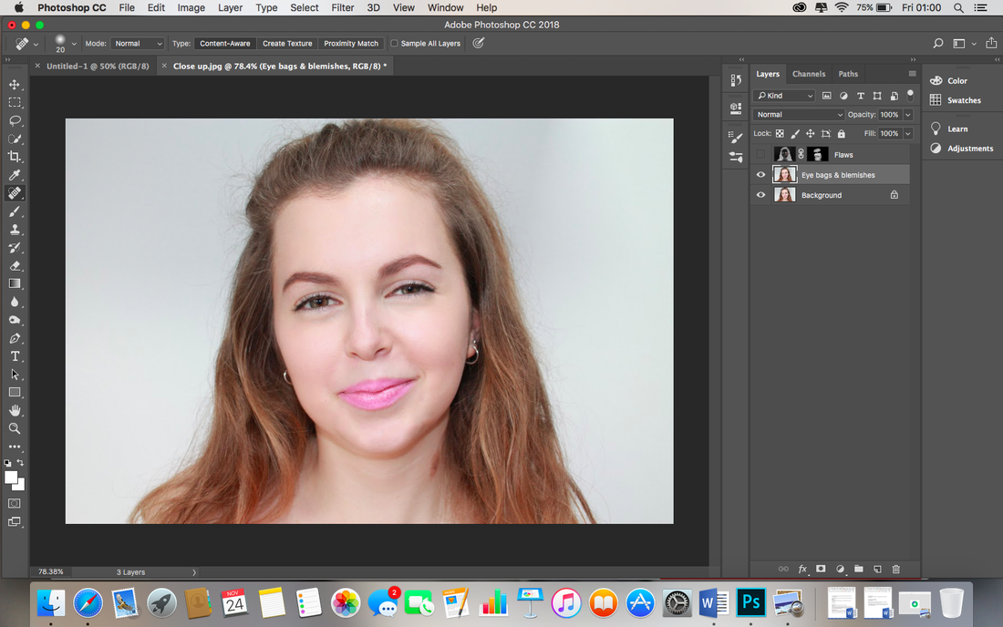
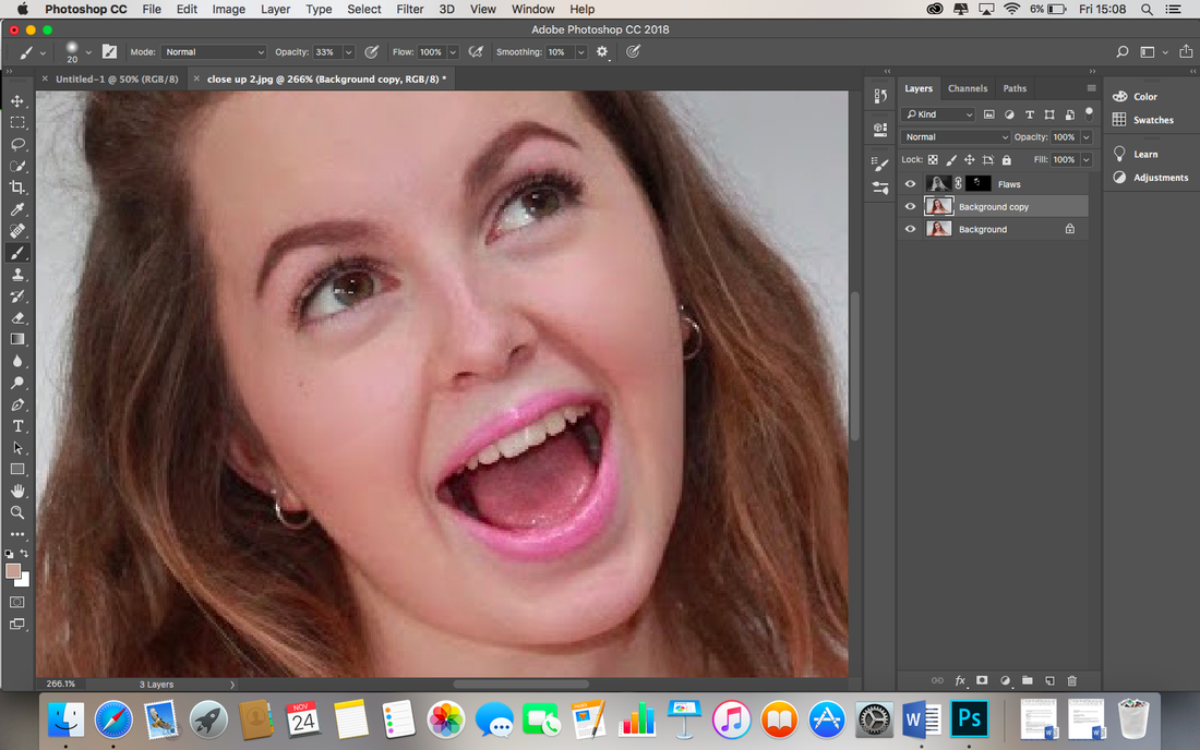
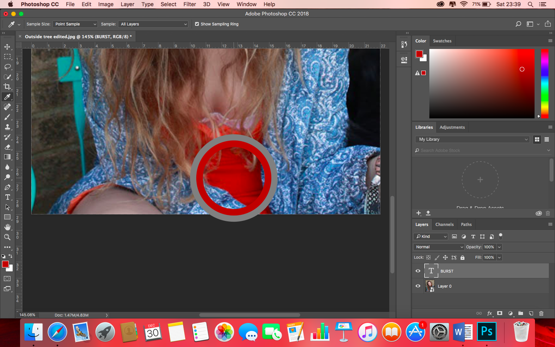
I copy of the image so far by pressing Cmd J. I move this layer to the top, rename it to 'Eye bags and blemishes', and select 'spot healing tool'.
|
I drag the tool over the lines and small blemishes of the models face and neck.
|

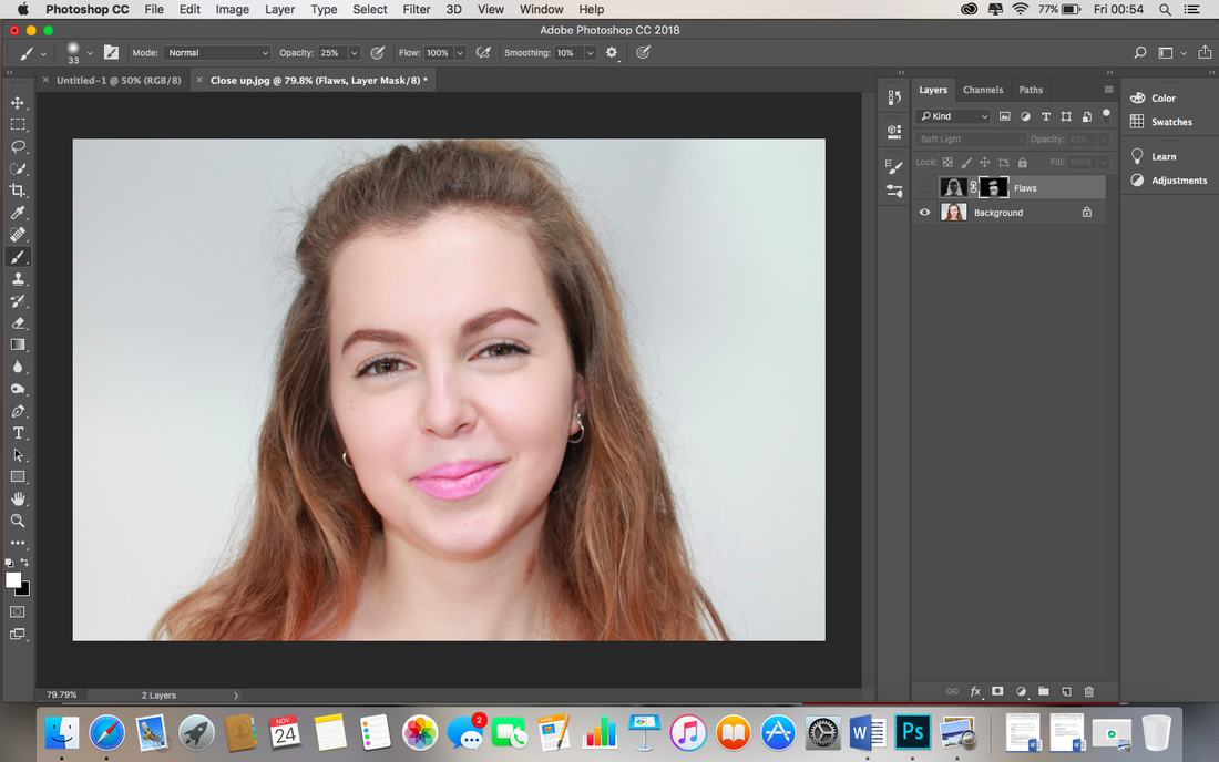
Although I like this effect, I realise the finish is too strong, so adjust the opacity to 62%, this gives the same finish but is less obviously edited.
|
|
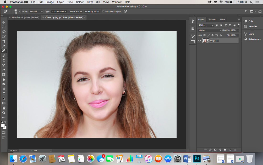
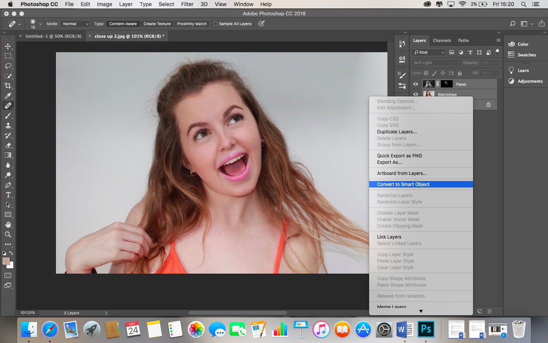
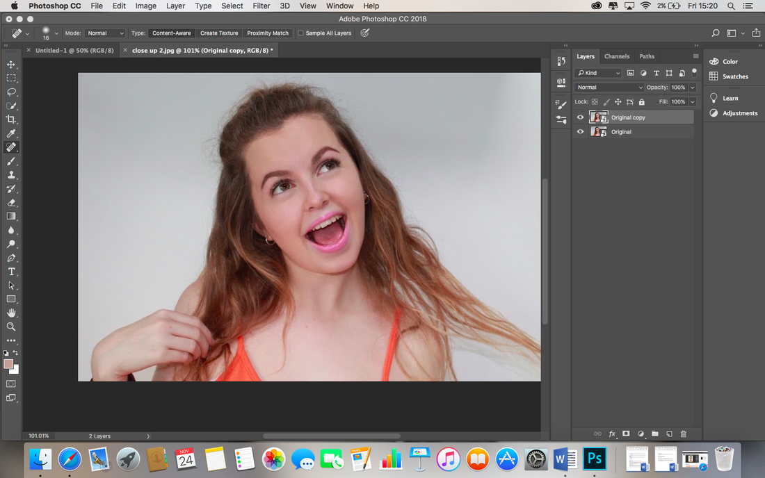
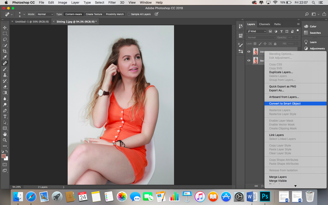
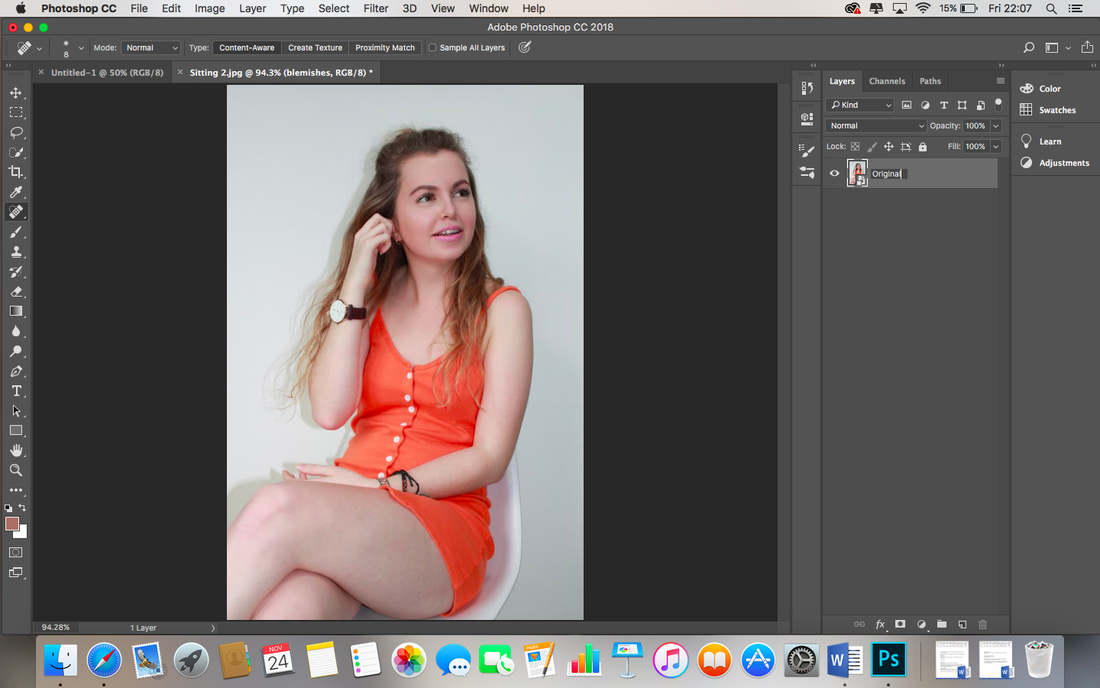
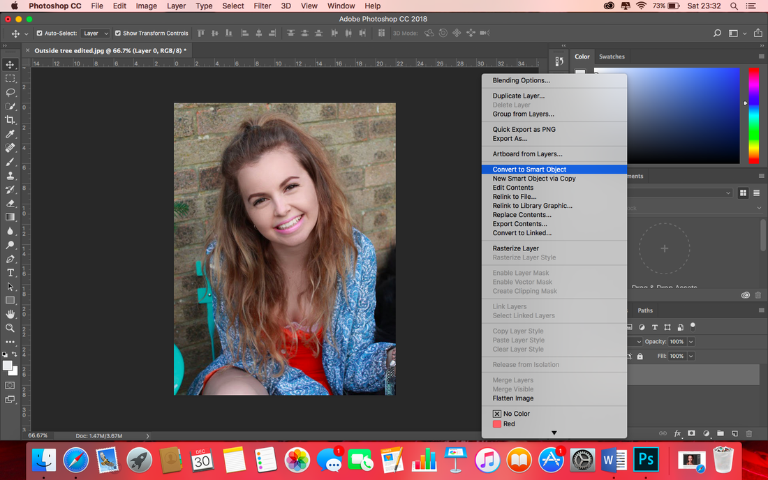
I save the work I have done so far, but keep them available for editing, by holding down the Cmd key, selecting all the layers, clicking with two fingers and choosing the option of 'Convert to Smart Object'. I rename the layer of work I have been working on so far as 'Original'. This means if I wish to come back and adjust the work I have done so far, I can easily do so, rather than repeatedly 'step backwards' or undoing and redoing my work. |
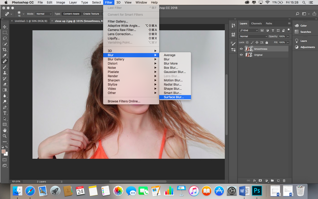
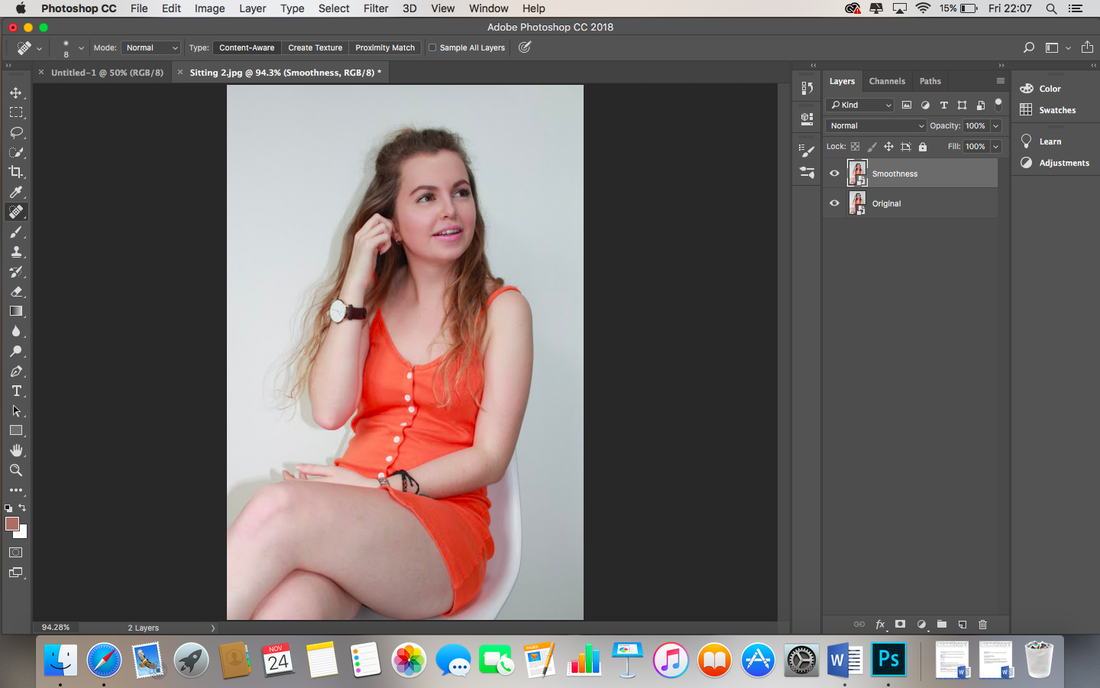
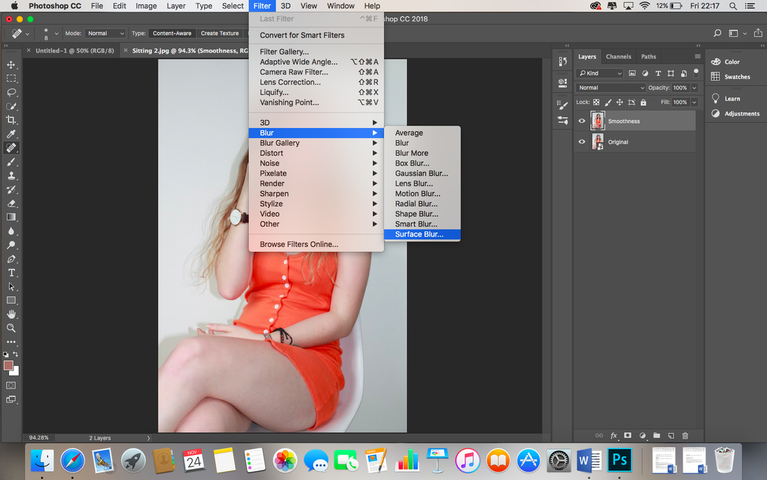
I copy the original layer and rename it to Smoothness. I select the smoothness layer and go to filter across the top bar, then Blur and Surface Blur.
|
I set the threshold layer as high as possible, heighten the radius till the face is not visible, then lower the threshold again until the details become visible. I press ok to confirm.
|
|
I now need to copy the Original layer again, rename the new copy as details, and move it to the top of the layers list. I will use this new Details layer to restore the skin texture and little details that were lost when I created the Smoothness layer. |
I make sure the Details layer is selected and go to Filter located on the bar at the top of the page, I then go down to Other and to High Pass. I need to adjust the radius settings until the details are just visible.
|
I go to the 'Normal' dropbox above the layers panel and change the blending mode of the Details layer from Normal to Linear Light.
|
|
I hold down the Cmd key and click on the Details and Smoothness layer at the same time to select them both, I then press the Cmd key and G key at the same time to group them, I then double click on where it says 'Group 1' and rename it to 'Airbrushing'. Doing this will save everything I have done so far, but allow me to come straight back to this point if I choose to adjust the work I have done. |

I add an inverted layer mask to the newly created Airbrushing group by holding down the Alt key and clicking the Add Layer Mask button (the rectangle with the circle in on the Layers panel).
|

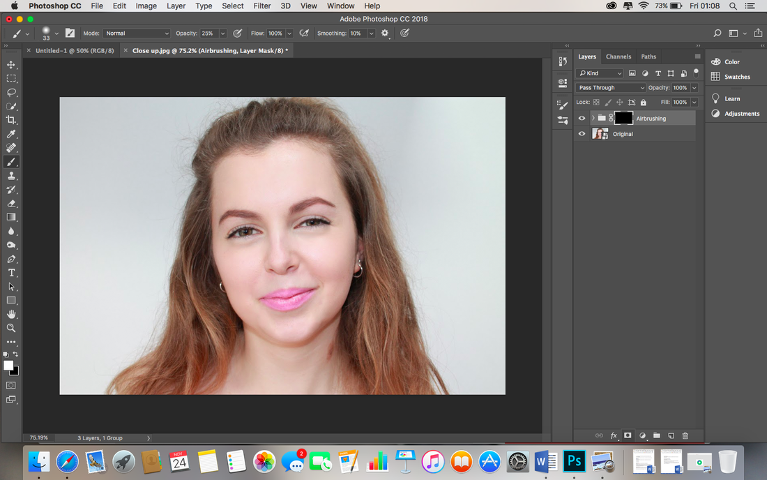
I check my foreground color is set to white, and then choose the Brush tool on the left hand side. I begin painting with an opacity of 50% but quickly undo what I have done and redo with a lowered opacity of 43%. I paint over all the skin areas and the airbrush finish comes through.
|
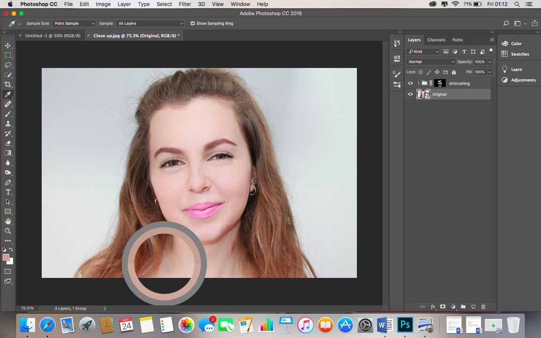
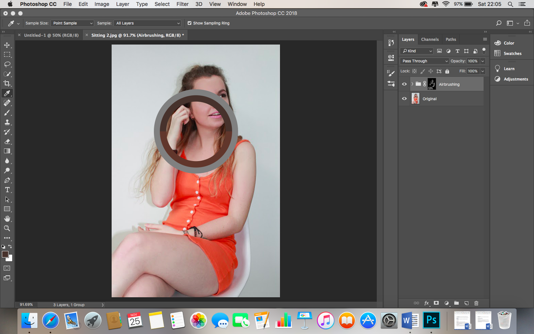
Now I would like to edit the skin colour of the model, I choose the Eye Dropper tool on the left side and choose a shade of skin I would like to use. I make sure the 'Sample' at the top says 'All layers' so I get an accurate, realistic colour.
|
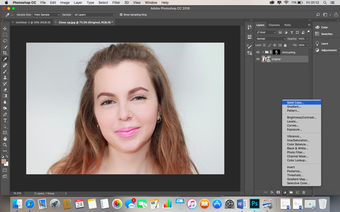
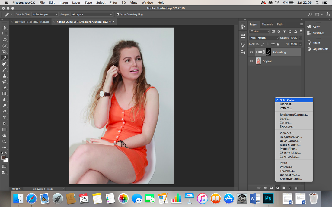
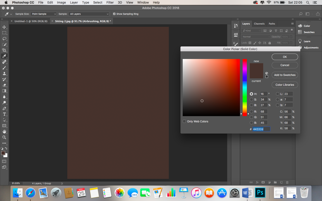
I click on the original picture in the layers panel and add a new Solid Colour adjustment layer by going to Layer, New Fill Layer, Solid Colour...
|
...I click ok...
|
I change the change the blending mode of this layer to colour.
|
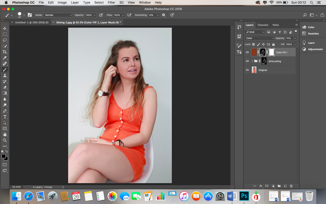
I click on the layer mask then invert it by pressing Cmd and I. I use the brush tool again to paint the skin with the new colour.
|
I lower the opacity so it doesn't look like bad fake tan. I rename the layer to Skin Colour.
|
First I create a new layer, this means if I want to edit the Airbrushing layer later, I do not have to undo all the dodging and burning.
|
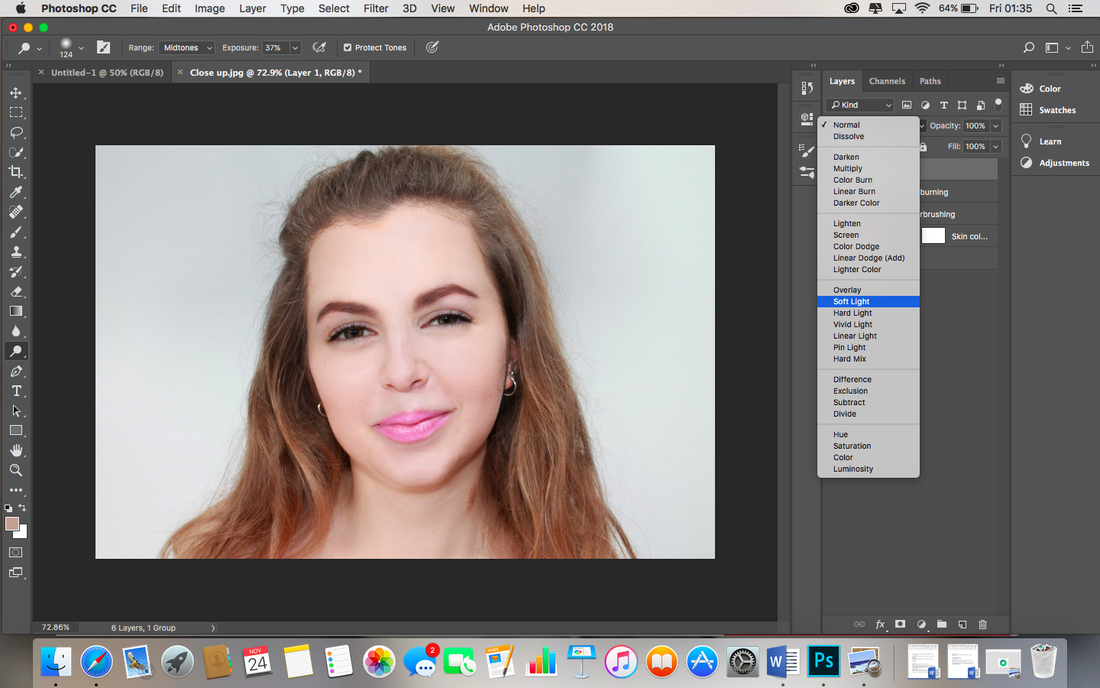
I create the new layer and rename it Dodging and Burning”, I then set the blending mode to Soft Light.
|
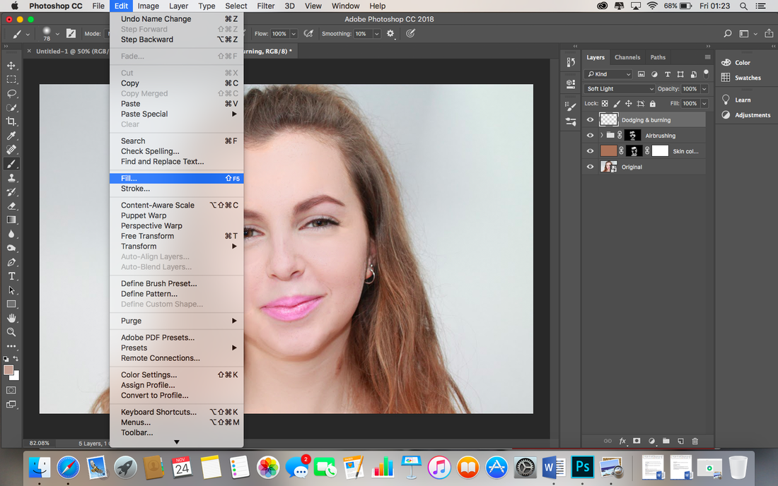
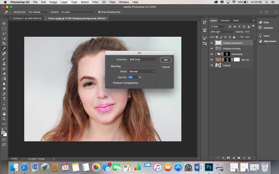
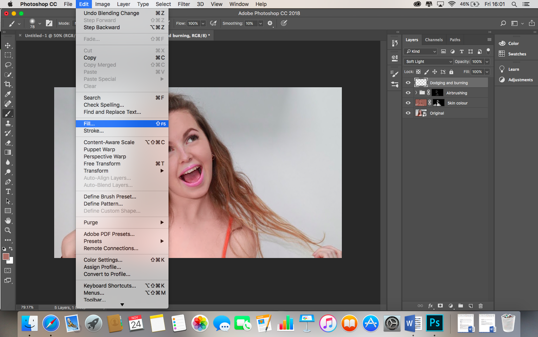
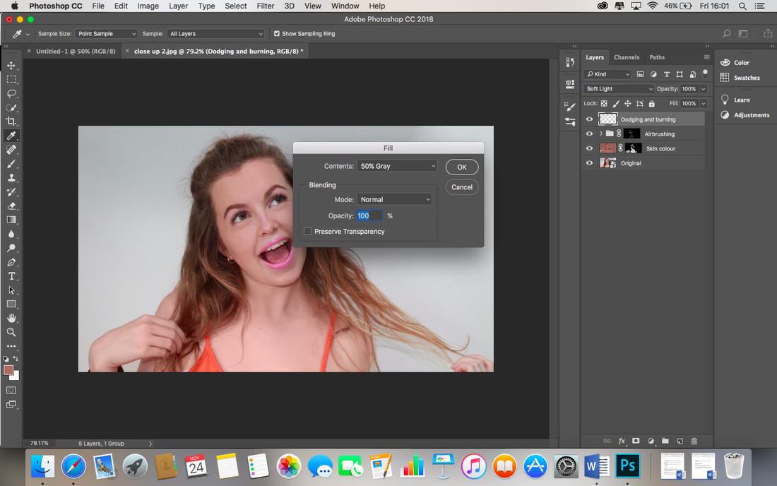
I go to Edit at the top, then Fill.
|
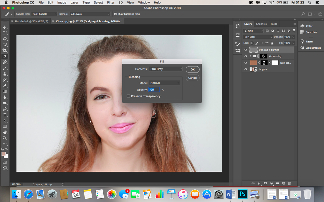
I set the contents to 50% grey and confirm by pressing ok.
|
|
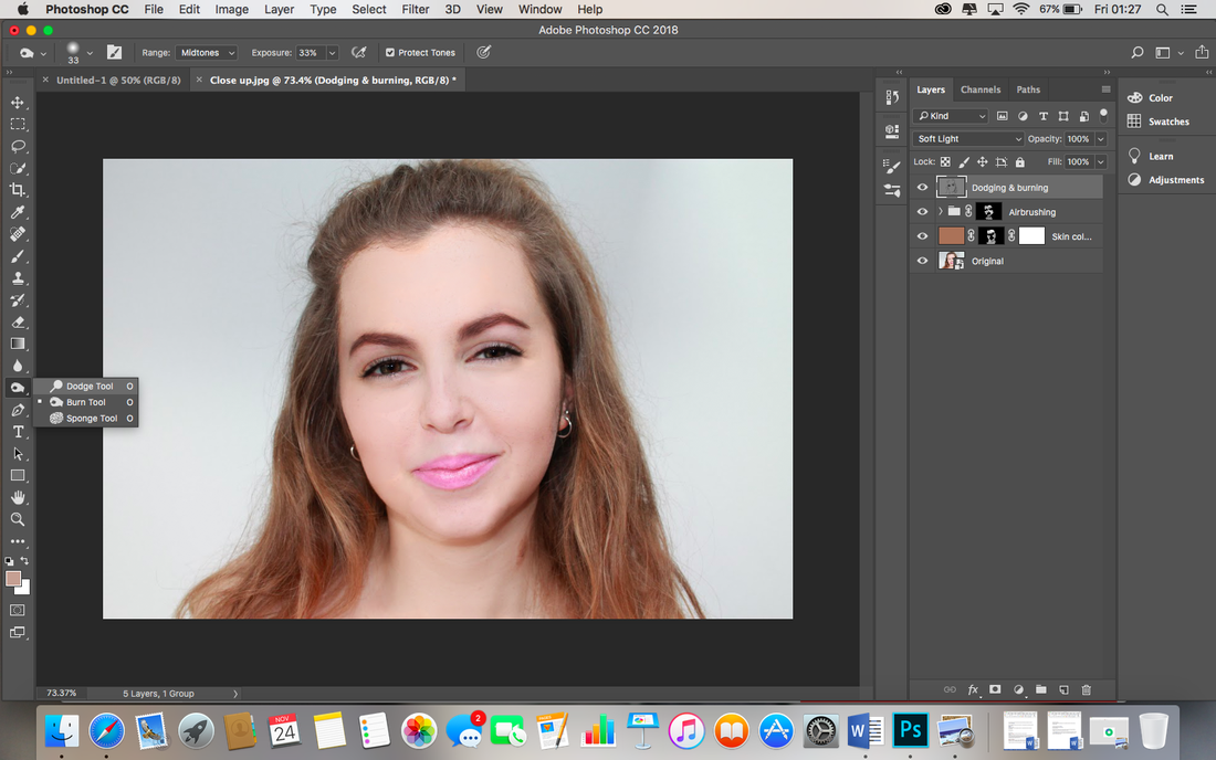
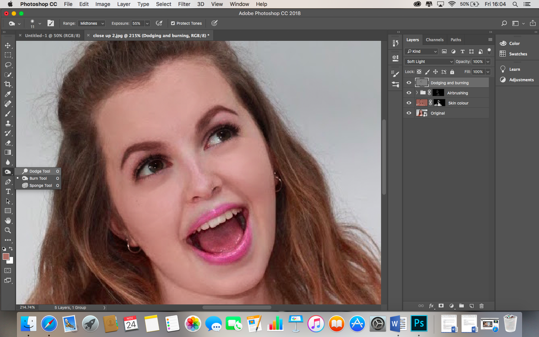
I go to the hand icon on the left hand side of the page, click with two fingers to see the options, and select the burn tool, I check that the Range setting in the options bar at the top is set to Midtones and exposure to 50%. I quickly realise this is much to high, and vary between 26% for the skin and 37% for the eyes and lips, as I want to accentuate these features. I paint the areas I want darkened. |
|
Now I want to lighten areas, I go back to the hand on the left hand side and use two fingers to click again which shows the options, this time I choose the Dodge tool. Again, I quickly ensure the Range setting at the top of the page is set to Midtones and paint the areas to lighten, such as the bridge of the nose, the centre of the lips and the whites of the eyes. |
|
|
|


|
My third image prior to editing. My aim of this Photoshop session is to airbrush the models skin and give more colour to her skin. As this shot is a close up, I will have to be extra careful with my technique to ensure I do not go over the edges. I will also brighten the white background. |
|

|
|
|
|
|
|

|
|
|
|

|
|
|
I copy the original layer, rename it Smoothness. I select 'Smoothness', go to Filter, Blur, Surface Blur. I set the threshold as high as possible, heighten the radius till the face is not visible, then lower the threshold until details become visible. I press ok.
|
I to copy the Original layer, rename it 'Details', drag it to the top of the list. I use the Details layer to restore the texture and details lost in the Smoothness layer. I select the details layer, go to Filter, Other and High Pass...
|
I adjust the radius settings until the details are just visible. At the 'Normal' dropbox above the layers panel, I change the blending mode of 'Details' from Normal to Linear Light.
|
I hold the Cmd key and click Details and Smoothness layer to select them both, I press Cmd and G to group them, I double click and rename it to 'Airbrushing'.
|
I hold down the Alt key and click 'Add Layer Mask'. I double check my foreground color is white and select the Brush tool, I paint with an opacity of 33% over all the skin and the airbrush finish comes through.
|
|
To adjust the skin tone, I select the Eye Dropper tool and choose a shade of skin. I ensure the 'Sample' says 'All layers'. |
|
I choose original picture layer and add a new Solid Colour adjustment layer by going to Layer, New Fill Layer, Solid Colour. |
|
Click ok. |
|
From the drop down box, I change the blending mode of this layer to Colour. |

|
I click on the layer mask then invert it by pressing Cmd and I. I use the brush tool again to paint the skin with the new colour. |

|
I adjust the opacity so the new skin tone is less intense and rename the layer to Skin Colour. |
|
I create a new layer and move it to the top of the layer list, I double click the new layer and rename it by typing 'Dodging and burning'. Then, from the drop down box, I choose a soft light blending mode. |
|
|
|
On the left hand side, I select the burn tool. I keep adjusting the exposure and opacity to ensure the darkness is under control. I used the burn tool on the eyelashes, eyes, lips, earrings, eyebrows, jaw line, lines on the neck and around the models hand to accentuate them. |
|
I then select the dodge tool to lighten; the whites of the eyes, the teeth and under the eyes. |
I realise the increased levels of dodging and burning have made the model look fake. However, I still want the areas I have highlighted to be accentuated.
|

To fix this, I have reduced the opacity so the highlighted areas are still accentuated but the finish is less intense.
|
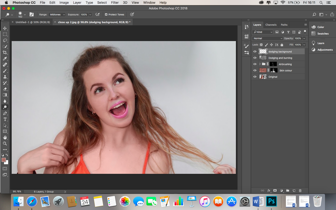
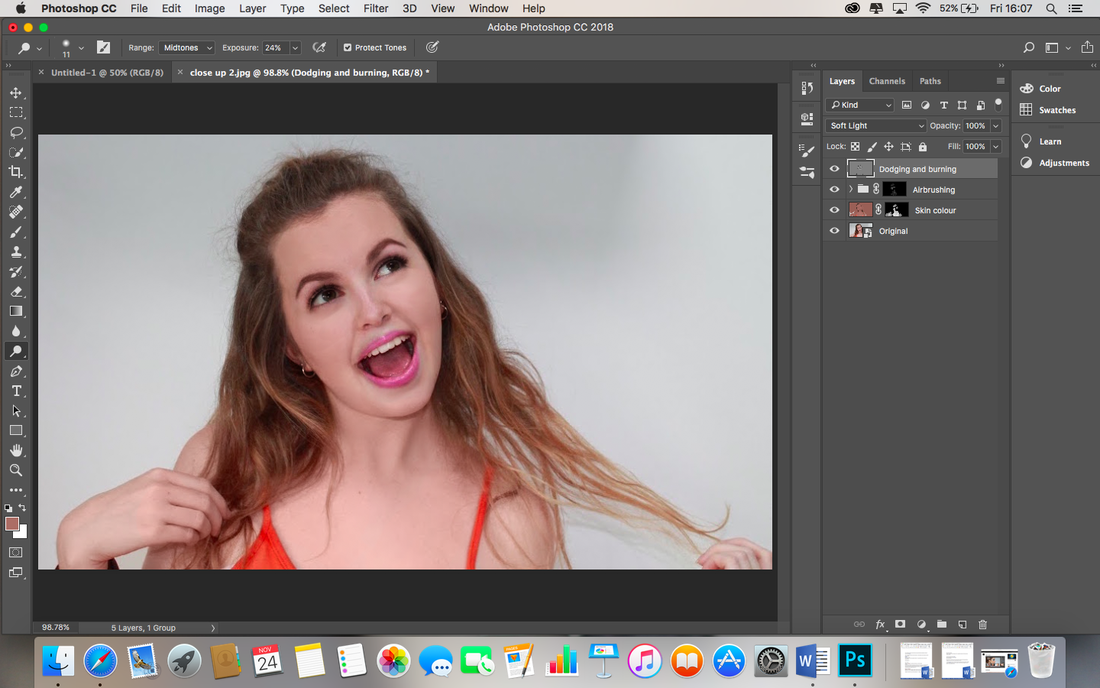
I repeat the process of creating a new layer and dodging, to lighten the background. This method allows me to slowly brighten the white of the background without losing the texture of the models hair etc.
|
I decided to play with the contrast, saturation and vibrance levels on the left hand side to further increase the impact of the editing I have done.
|

|
My third photo to edit is a mid shot, therefore I have more than just the face skin to focus on airbrushing. As the photo is not so close up, I will spend less time perfecting the face skin as there is less detail and more time on the arms and legs too. As a result, I will disregard the yellow channel editing technique I have used in my last two edits. |
|

|
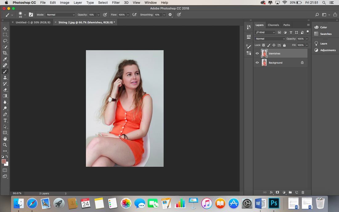
I merge current layers into a smart object by holding down Cmd and clicking with two fingers.
|
I rename the merged group Original.
|

I duplicate the layer by pressing Cmd J.
|
I rename the duplicated layer to Smoothness.
|
|
|

I copied the Original layer (Cmd J), dragged the layer to the top, double clicked and renamed it 'Details'.
|

I then went to Filter, Other and then High Pass.
|

I then adjusted the radius until I could see the details in the skin.
|

I changed the blending mode to hard light from the drop down box.
|
|
|
|
I group the Detail and Smoothness layers by selecting them both whilst holding the Cmd button, then releasing and pressing Cmd and G at the same time, I double click the group name to rename it 'Airbrushing'.
|
I add an inverted layer mask by holding down the Alt key and pressing the rectangle/circle icon in the bottom right corner, I then use a brush, adjusting the opacity as I go, to paint the airbrush finish from underneath onto key locations.
|
I select the eyedrop tool and choose a colour of the skin, double click to set.
I select Colour from the drop down box.
|
I add a new solid colour adjustment layer.
I invert the layer mask by pressing Cmd I. I then paint over the skin areas with a soft brush.
|
I click ok.
|
|
|
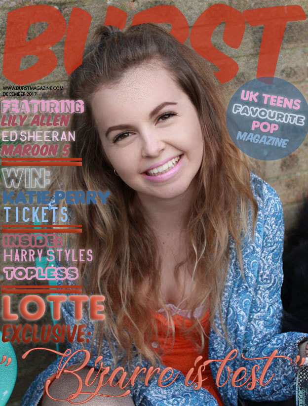
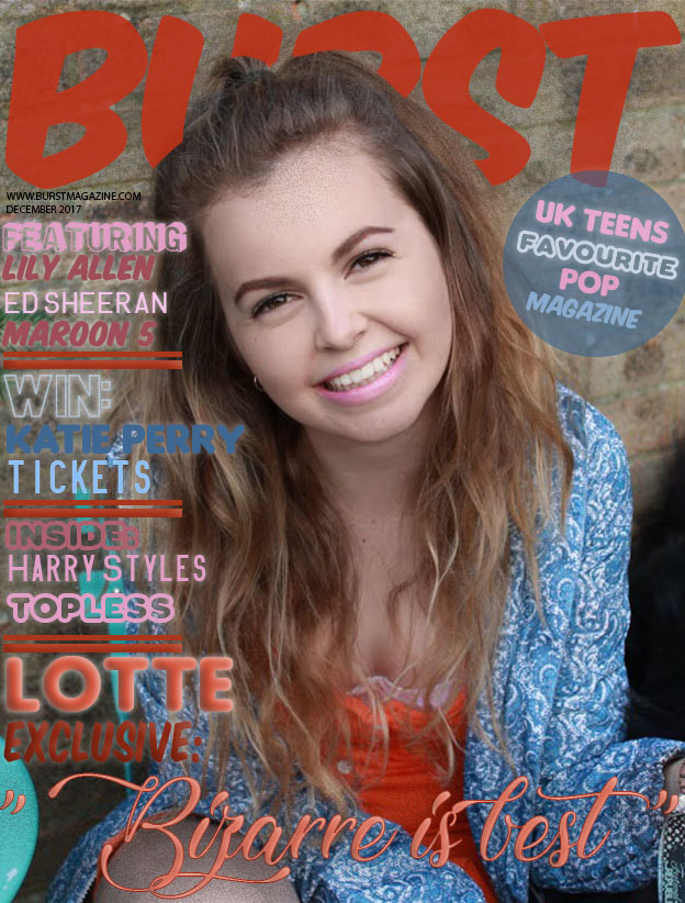
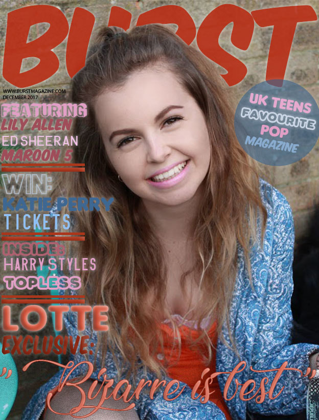
Before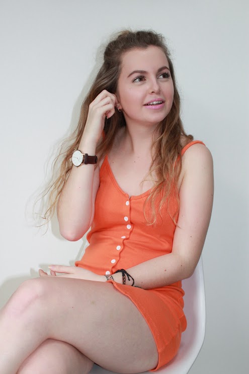
|
After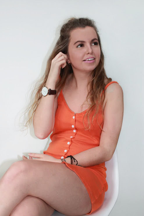
|
|
Canon Camera
I decided to use a Canon DSLR camera in order to ensure my pictures were of a high, professional standard, and of high quality. 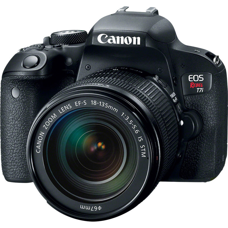
|
Plain white chair
This plain white chair was simple and yet effective in doing its job. It allowed me to create unique pictures with my model in different poses, and yet was plain enough to not take any attention away from my artist. 
|
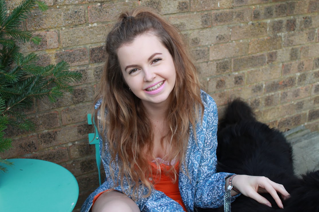
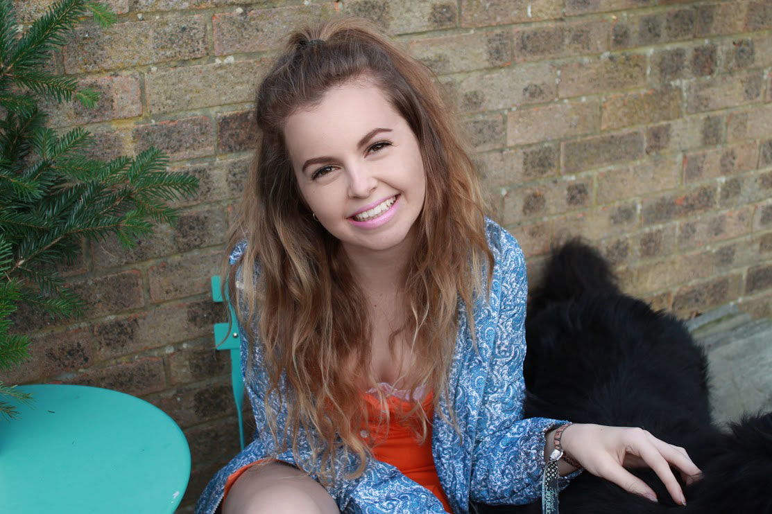
Dog
I decided to use a dog in 3 of the images on my magazine. Dogs are stereo typically loving animals and have close bonds with their owner, this will suggest to my target audience that the article they will read shall be personal and intimate. 
|

|
I understand it is important to competently understand conventions of layout and page design and appropriately integrate illustrations and text in order to create a professional, sleek and attractive magazine. If i can create a magazine which abides by conventions and coordinates illustration and text i will be likely to have a successful magazine. To the left if a Top of the Pops magazine, this magazine is attractive to very young people as the page is busy and full of colour, however it is unlikely to be successful for any other target audience as it looks messy, disorganized and therefore unprofessional and cheap.
|


|
|
|